
As most of you know, this past Saturday morning, the people of Hawaii got a shocking notification on their smartphones warning of a incoming ballistic missile and that this warning was not a drill. I can only imagine the fear that raced through the minds of more than a million people. This warning, as well all now know, turned out to be a false alarm accidentally set off by a state employee who was attempting to perform an internal test.
The first thing that went through my mind was how exactly is such an important function of a state emergency management system triggered so easily that it could be done by accident? Did a radar system show an incoming missile that was later discovered to be a mistake? No. As the Washington Post reported, the user interface for the system has a drop down menu with two items: Test Missile Alert and Missile Alert. The facts that these two options are so similarly named and that there is no confirmation dialogue for such an important command is at a minimum bad user interface design.
If I want do something as relatively innocuous as erasing all the data from my iPhone, I have to first find the feature that does this buried two levels deep in the Settings app where it’s clearly titled, “Erase All Contents and Settings.” Tapping it displays a dialog box asking me if I want to Backup Then Erase or just go ahead and Erase Now. If memory serves from the last time I did this, choosing Erase Now then reconfirms that I truly do want to erase all the contents and settings on my iPhone. That’s a lot of steps to accomplish a task that only affects one person: me. However, considering the magnitude of the result, it makes good sense that the user interface doesn’t make this very easy to do and actual makes sure you are deliberately trying to erase your phone.
Hawaii’s emergency management system does none of this. There apparently are just two menu items, one next to the other and once chosen, the computer immediately completes the task without confirmation. That’s just astonishing. What’s even worse, however, than the poor interface design on the part of whomever designed it, is that at a minimum (a) someone had to accept this poor interface design, (b) others had to use it without complaint that it could potentially cause the very situation it has caused.
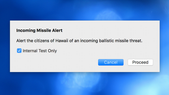
The Chairman of the FCC wants an an expensive investigation. Let’s please not spend $1 million or more of the taxpayer’s hard-earned money on a $100 fix. First, these two menu items should be reduced to a single menu item entitled, “Missile Alert…” The ellipsis tells the user that before this item performs its function, a dialog will be displayed to confirm it. The dialog that appears should be on that requires deliberate actions by the user to initiate a true warning to the population of Hawaii:
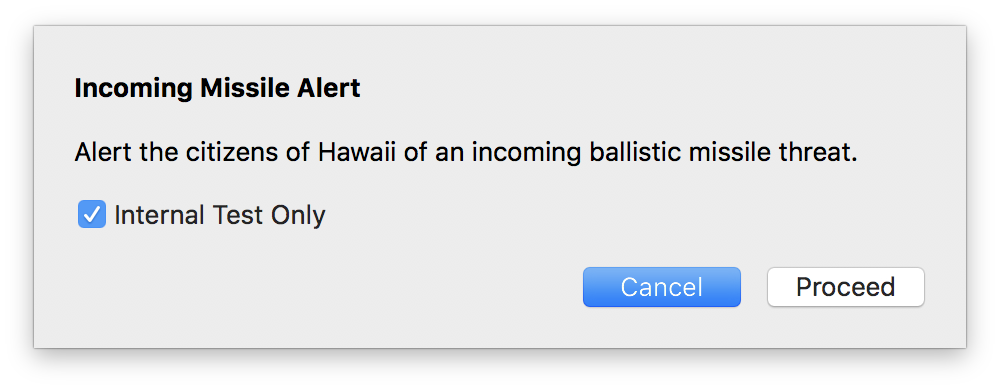
In the above example dialog box notice that in order to initiate a real warning, the user will not only have to uncheck the “Internal Test Only” checkbox but also have to deliberately click the Proceed button as the Cancel button is the default.
After taking those two deliberate actions, the user is then presented with a second dialog box to confirm that requires again clicking the Proceed button, another deliberate action.
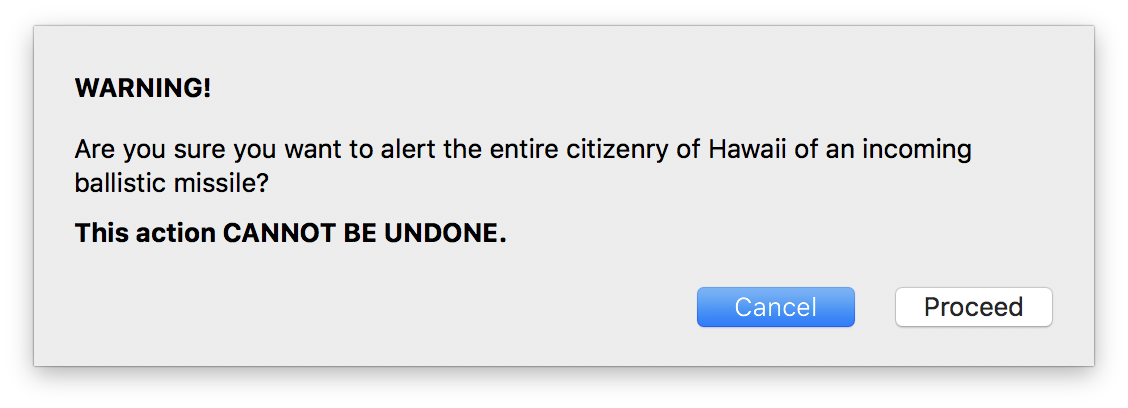
With this simple, 5 minute fix, it would be nearly impossible for someone to accidentally send out a warning when they meant to only perform an internal test.
Not all user interfaces have functions with such wide-reaching results. However, user interface guidelines for many years now have said that an action that cannot be undone should be confirmed. That’s a simple rule that all of us that design user interfaces would do well to remember.