
We continue to work towards Xojo support for iOS. Since the last update, we have been working on support for Auto Layout. We demonstrated Auto Layout at XDC last year. However, at the time we only had support for it in the framework; not the IDE. In case the term Auto Layout is unfamilar to you, it’s a technology for controlling the size and postion of controls. In Xojo today, you use the locking properties. We determined early in the development of our iOS framework that locking would not be sufficent for iOS since the user will often radically change the size of the layout by rotating the device. Instead of locking, you will use Auto Layout. Think of it as locking on steroids.
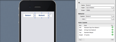
With Auto Layout you can set control positions and sizes to fixed values, but more often you use relative values or rules that define a control’s position and size. Instead of placing a control 20 points from the left edge of the layout, you can set the left value to be a “standard margin”. This means it will use the right amount of space based on the UI guidelines for the platform. If those change over time or on other devices, that spacing can automatically adjust. There are many other rules to choose from, let’s look at a few examples:
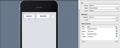
In this first example, Button1 is selected and in the Inspector you see an Auto Layout section rather than Locking and Position properties. In the Auto Layout section, Button1 has Left, Width, Top and Height just like the Position properties you have today. The important difference is that these properties can do a whole lot more. In this case, Left is set to Standard Margin to keep it at just the right delta from the left side of the layout. The width is fixed at 100 points but you could set it to auto-adjust the width based on the caption. The Top value, like the Left value, is set to Standard Margin as well. And the Height is fixed at 37 points but it could also be set to Standard Height. This would allow the button to automatically use the right height based on the platform. For example, on the desktop buttons on Linux are taller than on OS X or Windows. Instead of having to settle on a size that works for several platforms but is not best for each, Standard Height will automatically change to be exactly the right height for the given platform. Note that you can click on the images below to see them at full size.
There are several other optional rules that allow you to have even more control. There may also be times when the Auto Layout engine can’t resolve all of your rules at runtime. When that happens, the engine will choose which rules to drop based on priorty. Each rule has one and they are set automatically, though you can override them, most users will likely never have to bother. Auto-Layout will, most of the time, just do the right thing.
We have also added the ability for you to choose different size layouts (for difference devices) so you can see how your layouts look on iPhone 4, iPhone 5, iPad Mini and iPad Air sizes. You can switch between landscape and portrait as well to make sure your layouts will make sense in both orientations.
[youtube http://www.youtube.com/watch?v=_AGHhDLdHbA&w=420&h=315]
This video shows the different sizes, rotations and gives a minor demonstration of how the buttons react to their Auto-Layout rules:
While Auto Layout will initially be available only for iOS, we will be making it available for web and desktop layouts in future releases.
You’ve probably noticed that the layout editor is simulating the look of iOS6. While we use all native controls at runtime, since the Xojo IDE itself is not running on iOS, we must simulate the look of the controls. Before we ship, we will update the layout editor to simulate iOS7. And this is as good a time as any to mention that since iOS7 is already at 75% adoption, we will be supporting iOS7 only.
As you can see we are making excellent progress. Stay tuned for the next progress report.
UPDATE December 2014: Xojo iOS Support was released in Xojo 2014r3. If you don’t have the latest Xojo release, download it now and get to work on your next iOS app in your favorite RAD tool, Xojo!