
In this blog post I want to show you how to build a heatmap. In order to complete this project you’ll need the MBS Xojo ChartDirector Plugin, conveniently included in the Omegabundle right now.
A heatmap is a grid of fields that can have different sizes and colors. Heatmaps are often used to analyze website user behavior. Each area is assigned a color, and heat maps let you see the high and the low of that area. They often look like the image of a thermal camera, which is where the name comes from. Of course, a heatmap can also be used for displaying different temperatures, as its name so aptly describes. In this example we want to do that. We have the monthly mean temperature for a city for the last 10 years and we want to display this temperature by colors in a heatmap.
The Data
To do this, we first create an array in which we write the years we have and an array with the individual month names: The information in these arrays will be needed later for the labelling of the axes.
In order to be able to display values in a diagram, we want to write the values into a single array with all the months following with their values. We will combine the values as follow:
Array( Jan ( 0 ) … Jan ( 9 ) , Feb ( 0 ) … Feb ( 9 ) , Mar ( 0 ) … , … Dec ( 9 ) )
We start with the January values and append the other months behind it. We can highlight special parts of the heatmap by adding a star, a polygon or a cross of any color to the area.
Creating the Heatmap
Now we come to the creation of the actual diagram. We create an area 600 x 500 pixels in size; on this area we will later draw our chart and the legend. To do this, we create an instance of the class CDXYChartMBS and pass the size in the parameters.
Dim c As New CDXYChartMBS(600, 500)
Above the chart, with addTitle, we can add a title that describes our chart. Our chart should be on an area of 400 x 400 pixels and have a distance of 80 pixels from the top edge. The background color, as well as the grid color is transparent.
Dim p As CDPlotAreaMBS = c.setPlotArea(80, 80, 400, 400, -1, -1, CDBaseChartMBS.kTransparent, CDBaseChartMBS.kTransparent)
Now our symbol for minimum temperature is added. The minimum temperature is a small circle in a light blue color. In the addScatterLayer method we first specify the X and Y coordinate arrays as parameters then the title that will later be displayed in the legend next to the diagram and the shape of the symbol. Here we use PolygonShape. The number in the brackets behind the shape indicates the number of sides of the polygon. If this is 0, we see a circle. Then in the parameters follows the size of the symbol and the color. The structure is the same for other marks.
Call c.addScatterLayer(symbolX, symbolY, "Min value", CDBaseChartMBS.PolygonShape(0), 15, &hc6e2ff)
Now we create the heatmap with the method addDiscreteHeatMapLayer. It should have a size of 10 x 12 cells. 10 cells on the x axis and 12 cells on the y axis. In the parameters we first specify the array with the data and then the amount of cells on the x axis. For this we have to determined the array size of the array of the years. The cell amount for y axis is automatically determined from the amount of data.
Dim layer As CDDiscreteHeatMapLayerMBS = c.addDiscreteHeatMapLayer(zData, xLabels_size)
We now set the labels for the axes. With the method setLabels we specify the text. With the method xAxis.setLabelStyle we specify the font and the font color. The label should be rotated by 90 degrees on the x axis so that it is easier to read. With setLabelOffset we set the distance of the text to the grid border. With a value of 0, the text would be on the left or upper edges of the cell and not in the middle. With setXAxisOnTop we indicate that the text of the x axis should be above the diagram.
The setting of the y axis labels is similar
Call c.xAxis.setLabels(xLabels)
Call c.xAxis.setLabelStyle("Arial Bold", 10, CDBaseChartMBS.kTextColor, 90) c.xAxis.setColors(CDBaseChartMBS.kTransparent, CDBaseChartMBS.kTextColor)
c.xAxis.setLabelOffset(0.25)
c.setXAxisOnTop

Call c.yAxis.setLabels(yLabels)
Call c.yAxis.setLabelStyle("Arial Bold", 10) c.yAxis.setColors(CDBaseChartMBS.kTransparent, CDBaseChartMBS.kTextColor)
c.yAxis.setLabelOffset(0.25)
c.yAxis.setReverse
Now we want to specify the individual colors for the value ranges. For this we create a new array. In this array we first enter the lower limit of the temperature that the color should describe, then the color value in hexadecimal followed by the uppermost value. The uppermost value is at the same time the lowermost value of the next color, so we don’t enter it twice, but give directly the next color. Our values all have a distance of 3 degrees. Afterwards we create the array colorLabels, which describes the text for our legend
Dim colorScale() As Double = Array(0.0, &h104E8B, 0.0, &h00BFFF, 3.0, &h7FFFD4, 6.0, &hFFFF00, 9.0, &hFFC125, 12.00, &hFF7F00, 15.00, &hff4500, 18.00, &hcd0000, 21.00,&h8B0000, 21.10)
Dim colorLabels() As String = Array("<0.0", "0.0-3.0", "3.1-6.0", "6.1-9.0", "9.1-12.0", "12.1-15.0", "15.1-18.0", "18.1-21.0", „>21.0“)
We then apply the colors with colorAxis.setColorScale on the layer level.
layer.colorAxis.setColorScale(colorScale)
We place the legend 20 pixels to the right of the diagram. We use the font Arial Bold in size 10. With setKeySize we set the size of the legend boxes and with setKeySpacing the vertical distance between the individual legend entries.
Dim b As CDLegendBoxMBS = c.addLegend(p.getRightX + 20, p.getTopY, True, "Arial Bold", 10)
b.setBackground(CDBaseChartMBS.kTransparent, CDBaseChartMBS.kTransparent)
b.setKeySize(15, 15)
b.setKeySpacing(0, 8)
b.addText("Temp in °C“)
For the colors we use a trick, we read only the colors from the array that contains the color values and the temperature ranges by looking only at every second value. With the method addKey we then add the tag with the name and the extracted color.
For i As Integer = colorLabels_size - 1 DownTo 0
 Dim n As Integer = colorScale(i * 2 + 1)
 b.addKey(colorLabels(i), n)
Next
With the method makeChartPicture we get our diagram as picture:
pic = c.makeChartPicture
And you can show this picture as backdrop to better draw it with the paint event. If you use MakeChart with PDF type as parameter, you can get a PDF file to embed in a PDF page as vector graphics.
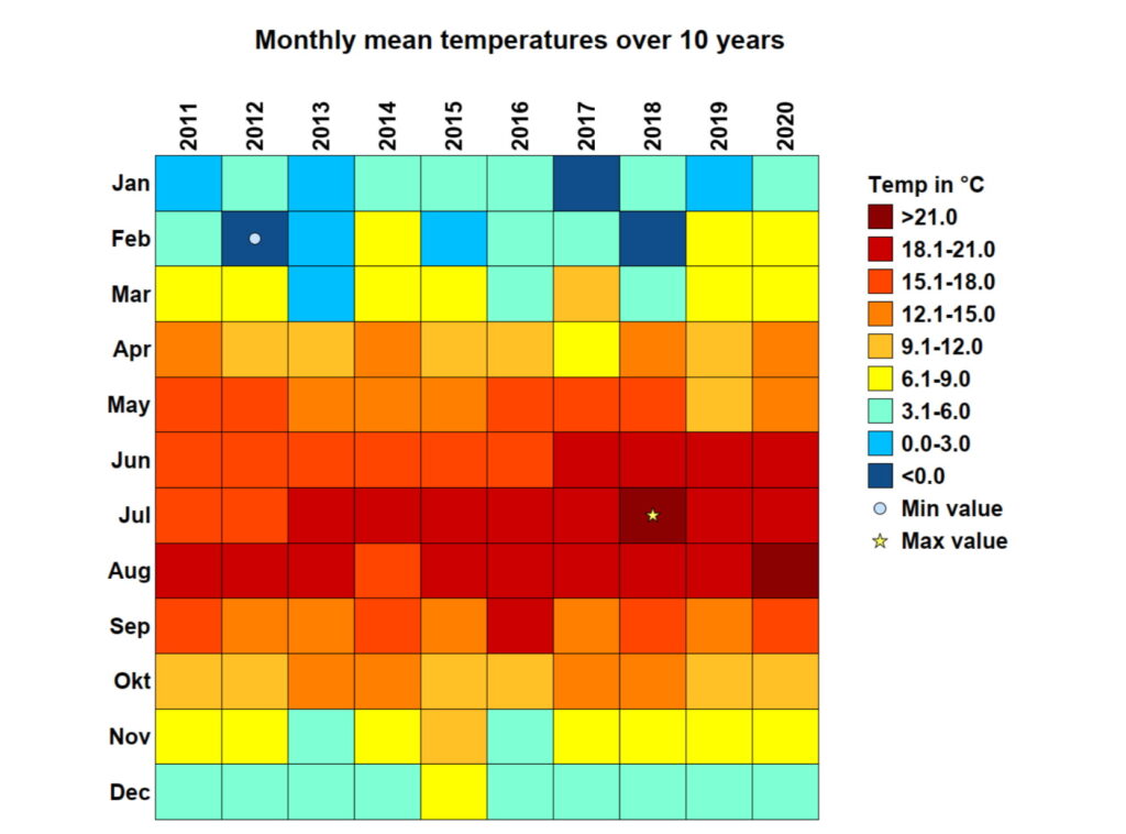
Then we can run the program and see our heatmap. You can then continue to work with this heatmap according to your own preferences. The final heat map looks like this:
As I mentioned at the beginning of this post, you’ll need the MBS Xojo ChartDirector Plugin which you can purchase on the MonkeyBread Software website; or, at the moment, it’s included in super the Omegabundle deal. Besides ChartDirector, Omegabundle includes a ton of other tools for the sensational price of 399.99$. For example, you also get a DynaPDF Starter license with which you can use to write the chart into a PDF file. If you want to attend the Xojo Developer Conference 2022 in London and meet us, Omegabundle includes a discount of 100$ for the conference! Read articles from the Xdev developer magazine on the way to the conference, because it’s also included in the bundle! Have a look at the Omegabundle. It’s worth it. I hope you enjoy the heatmap!
Stefanie Juchmes studies computer science at the University of Bonn. She came in touch with Xojo due to the work of her brother-in-law and got a junior developer position in early 2019 at Monkeybread Software. You may have also read her articles in Xojo Developer Magazine.