
In our previous installment, we successfully wired up keyboard focus to our custom DesktopCanvas subclass, making it fully accessible and user-friendly.
Now, we’re going to tackle another key feature: customizable text alignment. By the end of this tutorial, you’ll be able to set the button’s text to align left, center, or right, and we’ll introduce a small amount of padding to keep the text from touching the edges when it’s not centered. This approach uses a strongly typed Enumeration to ensure we only accept valid alignment values, maintaining the high quality of our custom control.
1. Define the Text Alignment Options
To make our alignment property easy to use and type-safe, we will define a new enumeration inside the CanvasButton class.
Inside your CanvasButton class, go to Insert > Enumeration and add the following:
  Left = 0
  Center = 1
  Right = 2
2. Add New Properties for Alignment and Padding
Next, we need two new properties in the CanvasButton class to store the selected alignment and the padding value.
The TextAlignment property will use our new TextAlign enumeration, and, crucially, it defaults to TextAlign.Center.
The TextPadding property provides an adjustable inner margin, which is especially important for left and right alignment.
Public Property TextAlignment As TextAlign = TextAlign.Center
Public Property TextPadding As Integer = 8
3. Update the Paint Method
The core of this change happens in the Paint event handler. We need to modify the logic that calculates the horizontal position of the text (tx) to respect the value of our new TextAlignment property.
Locate the Paint event and replace the existing code with the following:
Sub Paint(g As Graphics, areas() As Rect) Handles Paint
  #Pragma unused areas

  // Use the custom CornerRadius property.
  Var currentCornerRadius As Integer = CornerRadius

  // Declare variables for the colors used in drawing.
  Var currentBgColor As Color
  Var currentBorderColor As Color
  Var currentTextColor As Color

  // Determine colors based on the button's current state (enabled, pressed, hovered).
  If Enabled Then
    If IsPressed Then
      // Use highlight color if pressed.
      currentBgColor = HighlightColor
      currentBorderColor = BorderColor
      currentTextColor = TextColor
    ElseIf IsHovered Then // Check for hover only if not pressed
      // Use hover color if hovered.
      currentBgColor = HoverColor
      currentBorderColor = BorderColor
      currentTextColor = TextColor
    Else
      // Use the custom background color for the default state.
      currentBgColor = BackgroundColor
      currentBorderColor = BorderColor
      currentTextColor = TextColor
    End If
  Else
    // Use appropriate system or standard gray colors for the disabled state.
    currentBgColor = Color.LightGray
    currentBorderColor = Color.Gray
    currentTextColor = Color.DisabledTextColor // Use system disabled text color
  End If

  // Set the drawing color and draw the background shape with rounded corners.
  g.DrawingColor = currentBgColor
  g.FillRoundRectangle(0, 0, g.Width, g.Height, currentCornerRadius, currentCornerRadius)

  // Set the drawing color and pen size for the border.
  g.DrawingColor = currentBorderColor
  g.PenSize = 2
  // Draw the border shape just inside the background rectangle.
  g.DrawRoundRectangle(0, 0, g.Width, g.Height, currentCornerRadius, currentCornerRadius)

  // Draw the focus ring
  If IsFocused And AllowFocusRing Then
    g.DrawingColor = Color.HighlightColor
    g.PenSize = 1
    g.DrawRoundRectangle(2, 2, g.Width-4, g.Height-4, CornerRadius-2, CornerRadius-2)
  End If

  // Enable anti-aliasing for smoother text rendering.
  g.AntiAliasMode = Graphics.AntiAliasModes.HighQuality
  g.AntiAliased = True
  // Calculate the width and height of the button text.
  Var tw As Double = g.TextWidth(ButtonText)
  Var th As Double = g.TextHeight
  // Calculate the X position to center the text horizontally.
  // Updated: compute X based on TextAlignment (Left, Center, Right) while preserving centered behavior as default.
  Var tx As Double
  Select Case TextAlignment
  Case TextAlign.Left
    tx = TextPadding
  Case TextAlign.Right
    tx = g.Width - tw - TextPadding
  Case TextAlign.Center
    tx = (g.Width - tw) / 2
  End Select
  // Calculate the Y position to center the text vertically, with a small adjustment.
  Var ty As Double = (g.Height + th) / 2 - 3
  // Set the drawing color for the text.
  g.DrawingColor = currentTextColor
  // Draw the button text at the calculated centered position.
  g.DrawText(ButtonText, tx, ty)
End Sub
The magic happens at line 60 🙂
4. Inspector Integration
If you want the alignment to be easily adjustable in the Xojo Inspector, you should expose the TextAlignment and TextPadding properties. For TextAlignment, because it uses an Enumeration, Xojo will automatically display a helpful dropdown menu with Left, Center, and Right options once you expose it through the Inspector Behavior editor.
- Right-click the
CanvasButtonclass in the Project Navigator. - Select ‘Inspector Behavior…’
- Scroll through the property list and check the checkboxes for both
TextAlignmentandTextPadding.
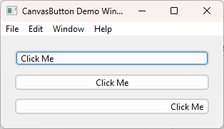
Try It Out
You can now set the text alignment directly in the code or via the Inspector.
For example, to set alignment in code:
// Set the button to right-aligned text
MyCanvasButton.TextAlignment = CanvasButton.TextAlign.Right
Since the default value for TextAlignment is Center, no existing code needs to be modified, and all your current custom buttons will continue to render perfectly centered unless you explicitly change the alignment property.
Hope this update was useful.
You can grab the latest source on GitHub: GitHub – CanvasButton
More in this series:
- How To Create a Custom Button Control in Xojo
- How To Create a Custom Button Control in Xojo – Part 2
- How To Create a Custom Button Control in Xojo – Part 3: Make Your Controls Inspector-Friendly
- How To Create a Custom Button Control in Xojo – Part 4: Adding Focus
- How to Create a Custom Button Control in Xojo – Part 5: Adding Text Alignment
Gabriel is a digital marketing enthusiast who loves coding with Xojo to create cool software tools for any platform. He is always eager to learn and share new ideas!