
In the first part of this tutorial, we built a basic custom button control using the DesktopCanvas class, giving it a custom appearance and handling the basic mouse events to provide visual feedback and raise a Pressed event when clicked.
In this second part, we will enhance our CanvasButton by adding more customization with new properties to:
- set the button’s colors for different states (default, hovered, pressed)
- adjust the corner radius of the button
- implement a disabled state
Let’s get started!
Adding New Properties for Customization
We need to add several properties to our CanvasButton class to store the custom colors for different states, the border color, the text color, the corner radius, and the enabled state.
- In the Project Navigator, select your
CanvasButtonclass. - Go to Insert > Property (or right-click the class and select Add to “CanvasButton” > Property).
- Add the following properties with the specified names, types, and default values:
- Name:
BackgroundColorType:ColorDefault Value:&c5e2d8b - Name:
HoverColorType:ColorDefault Value:&c729fcf - Name:
HighlightColorType:ColorDefault Value:&c628eff - Name:
BorderColorType:ColorDefault Value:&c525252 - Name:
TextColorType:ColorDefault Value:&ceeeeee - Name:
CornerRadiusType:IntegerDefault Value:4
- Name:
These properties will hold the values that determine the button’s appearance and behavior.
Updating Event Handlers for the Enabled State
We need to modify the existing mouse event handlers (MouseDown, MouseEnter, MouseExit, MouseUp) to check if the button is Enabled before processing any mouse actions.
Select each of the following event handlers in the CanvasButton class and update the code as shown:
MouseDown(x As Integer, y As Integer) As Boolean
#Pragma unused x
#Pragma unused y

// Only process if the button is enabled.
If Enabled Then
  // Set internal state to indicate the button is being pressed.
  IsPressed = True
  // Refresh the control to show the pressed state visually.
  Refresh(False)
  // Return True to indicate that this event was handled.
  Return True
Else
  // If disabled, do not handle the event.
  Return False
End If
MouseEnter()
// Only process if the button is enabled.
If Enabled Then
  // Set internal state to indicate the mouse is hovering over the button.
  IsHovered = True
  // Refresh the control to show the hover state visually.
  Refresh(False)
End If
MouseExit()
// Only process if the button is enabled.
If Enabled Then
  // Set internal state to indicate the mouse is no longer hovering.
  IsHovered = False
  // Reset pressed state if mouse leaves while pressed (prevents accidental clicks).
  IsPressed = False
  // Refresh the control to revert from the hover state.
  Refresh(False)
End If
MouseUp(x As Integer, y As Integer) As Boolean
#Pragma unused x
#Pragma unused y

// Only process if the button is enabled.
If Enabled Then
  // Check if the button was pressed down AND the mouse is still hovering over it.
  If IsPressed And IsHovered Then
    // If true, the button was successfully clicked. Raise the custom Pressed event.
    RaiseEvent Pressed
  End If
  // Reset the pressed state regardless of whether the click was successful.
  IsPressed = False
  // Refresh the control to revert from the pressed state.
  Refresh(False)
End If
In these updated event handlers, we added an If Enabled Then check at the beginning. If the button is not enabled, the code inside the If block is skipped, preventing the button from reacting to mouse interactions. We also added #Pragma unused to the parameters x and y in MouseDown and MouseUp as they are not used in the code, which helps avoid compiler warnings. In MouseExit, we added IsPressed = False to ensure the pressed state is reset if the mouse leaves the button while the mouse button is held down.
Updating the Paint Event for Enhanced Appearance
The most significant changes will be in the Paint event where we will use the new properties to draw the button based on its current state (enabled/disabled, hovered, and pressed).
Select the Paint(g As Graphics, areas() As Rect) event handler and replace its content with the following code:
#Pragma unused areas

// Use the custom CornerRadius property.
Var currentCornerRadius As Integer = CornerRadius

// Declare variables for the colors used in drawing.
Var currentBgColor As Color
Var currentBorderColor As Color
Var currentTextColor As Color

// Determine colors based on the button's current state (enabled, pressed, hovered).
If Enabled Then
  If IsPressed Then
    // Use highlight color if pressed.
    currentBgColor = HighlightColor
    currentBorderColor = BorderColor
    currentTextColor = TextColor
  ElseIf IsHovered Then // Check for hover only if not pressed
    // Use hover color if hovered.
    currentBgColor = HoverColor
    currentBorderColor = BorderColor
    currentTextColor = TextColor
  Else
    // Use the custom background color for the default state.
    currentBgColor = BackgroundColor
    currentBorderColor = BorderColor
    currentTextColor = TextColor
  End If
Else
  // Use appropriate system or standard gray colors for the disabled state.
  currentBgColor = Color.LightGray
  currentBorderColor = Color.Gray
  currentTextColor = Color.DisabledTextColor // Use system disabled text color
End If

// Set the drawing color and draw the background shape with rounded corners.
g.DrawingColor = currentBgColor
g.FillRoundRectangle(0, 0, g.Width, g.Height, currentCornerRadius, currentCornerRadius)

// Set the drawing color and pen size for the border.
g.DrawingColor = currentBorderColor
g.PenSize = 2
// Draw the border shape just inside the background rectangle.
g.DrawRoundRectangle(1, 1, g.Width-2, g.Height-2, currentCornerRadius, currentCornerRadius)

// Enable anti-aliasing for smoother text rendering.
g.AntiAliasMode = Graphics.AntiAliasModes.HighQuality
g.AntiAliased = True
// Calculate the width and height of the button text.
Var tw As Double = g.TextWidth(ButtonText)
Var th As Double = g.TextHeight
// Calculate the X position to center the text horizontally.
Var tx As Double = (g.Width - tw) / 2
// Calculate the Y position to center the text vertically, with a small adjustment.
Var ty As Double = (g.Height + th) / 2 - 3
// Set the drawing color for the text.
g.DrawingColor = currentTextColor
// Draw the button text at the calculated centered position.
g.DrawText(ButtonText, tx, ty)
Let’s break down the changes in the Paint event:
- We now use the
CornerRadiusproperty instead of a static constant for drawing the rounded rectangles. - We introduced an
If Enabled Then ... Elseblock. - Inside the
If Enabled Thenblock, we have a nestedIf IsPressed Then ... ElseIf IsHovered Then ... Elsestructure. This determines thecurrentBgColor:- If
IsPressedis True,currentBgColoris set toHighlightColor. - If
IsPressedis False butIsHoveredis True,currentBgColoris set toHoverColor. - If neither
IsPressednorIsHoveredis True,currentBgColoris set toBackgroundColor. - The
currentBorderColorandcurrentTextColorare set directly from theBorderColorandTextColorproperties when the button is enabled.
- If
- Inside the
Elseblock (whenEnabledis False), we set the colors to standard gray values (Color.LightGrayfor background,Color.Grayfor border, andColor.DisabledTextColorfor text) to give the button a disabled appearance. - Finally, the drawing commands use these
currentBgColor,currentBorderColor,currentTextColor, andcurrentCornerRadiusvariables.
Using the Enhanced Custom Control
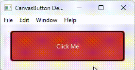
Now that our CanvasButton has more customization options and supports a disabled state, let’s see how to use these features.
- If you don’t already have an instance, drag the
CanvasButtonclass from the Project Navigator onto a window in the Layout Editor. - You can now access and set the new properties programmatically. For example, in a button’s
Openingevent, you could add code like this:
// Customize colors
Me.BackgroundColor = Color.RGB(200, 50, 50) // A shade of red
Me.HoverColor = Color.RGB(255, 100, 100) // A lighter red for hover
Me.HighlightColor = Color.RGB(150, 0, 0) // A darker red for pressed
Me.BorderColor = Color.Black
Me.TextColor = Color.White

// Adjust corner radius
Me.CornerRadius = 10
You can experiment with different values to see how they affect the button’s appearance. To test the disabled state, you can set the Enabled property to False.
Conclusion
We’ve now taken our custom button to the next level by adding extensive color customization, adjustable corners, and a disabled state.
This project can be downloaded from GitHub at: https://github.com/xolabsro/CanvasButton
Hope you enjoyed making the button your own! While it’s much more flexible now, there might be other features we could add down the road, so stay tuned!
More in this series:
- How To Create a Custom Button Control in Xojo
- How To Create a Custom Button Control in Xojo – Part 2
- How To Create a Custom Button Control in Xojo – Part 3: Make Your Controls Inspector-Friendly
- How To Create a Custom Button Control in Xojo – Part 4: Adding Focus
- How to Create a Custom Button Control in Xojo – Part 5: Adding Text Alignment
Gabriel is a digital marketing enthusiast who loves coding with Xojo to create cool software tools for any platform. He is always eager to learn and share new ideas!