
Do you want to work with chart in your Xojo application? You can use the MBS ChartDirector Plugin in conjunction with the ChartDirector library to display charts. In this article I would like to show you some examples that demonstrate some possibilities you have to create charts.
In this example we create a pie chart. A pie chart has one-dimensional data, that means that we need to filled one array with data. Here is our example:
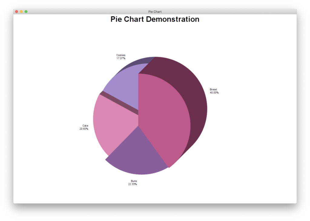
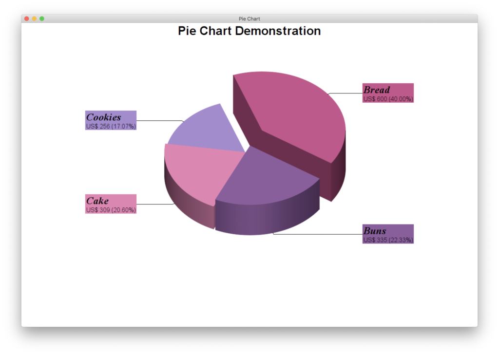
Imagine a bakery making $1,500 a day. We now want to read from our chart what percentage of the profit is made by bread, buns, cakes and cookies. For this we enter in our array the 600$ of bread, 335$ of buns, 309$ of cake and 256$ of cookies.
So our array definition looks like this:
Dim data(-1) As Double = Array (600, 335, 309, 256)
We don’t have to worry about the percentage, because it is automatically calculated based on the specified array.
Now we create another array with the corresponding labels. It must be ensured that the label sequence corresponds to the order of the data sequence.
Dim labels(-1) As String = Array (“Bread”, “Buns”, “Cake”, “Cookies”)
We also arrange the colors of the individual circle sections as an array. Here is a small tip: You can use already known color combinations, lists of color combinations that harmonize well with each other can be found in the Internet in large numbers.
I have chosen a combination of pink and purple tones:
Dim colors(-1) As Integer
colors.Append &hBB397A
colors.Append &h7B448D
colors.Append &hDE69A5
colors.Append &h9672c6
Then we create our diagram working environment.
Dim c As New CDPieChartMBS(600, 400, &hffffff, &hffffff, 0)
In the parameters we can set the height and width of the working environment, the background color, the edge color and the stars of the elevation effect.
In the image you can see a working environment with a red background, blue edge color and the elevation of 5, additionally the corners have been rounded with the method setRoundedFrame.
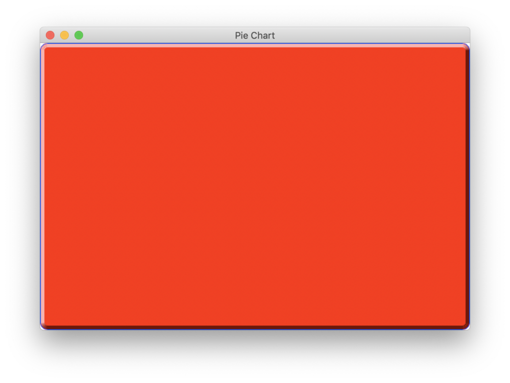
But for our example we take a white background.
Then we can insert the title of the diagram that should appear in the middle of the upper side. In the parameters we can set the text, font, font size, font color, font box background color and the text box border color. In our example we define only the text and leave the remaining parameters at the default values.
call c.addTitle(“Pie Chart Demonstration”)
Now we can make some settings for the chart.
First we define the size and position of the pie chart.
c.setPieSize(300, 200, 110)
Our working area has a size of 600×400 which means that if we want to position the chart in the middle of our working area we have to halve these values so we get 300 and 200 which we then specify in the parameters. The third parameter describes the size of the pie chart with the radius. If we had a ring chart instead of a pie chart, the inner radius would be given in a fourth parameter and the called function would be setDonutSize.
Afterwards we can specify the color of the data areas.
In the first parameter we specify that we want to set the data color, because the SetColors method can be used in many more areas. In the second parameter we specify the already created array colors :
c.setColors(c.kDataColor, colors)
Then we can set that our pie chart should be shown as a 3D figure and with the command:
c.set3D(deeps, 45, False)
Set the heights of the segments so that they look like stairs and the angle with which we look at the chart. The point of view depends on the shadow mode, which is switch off by default.
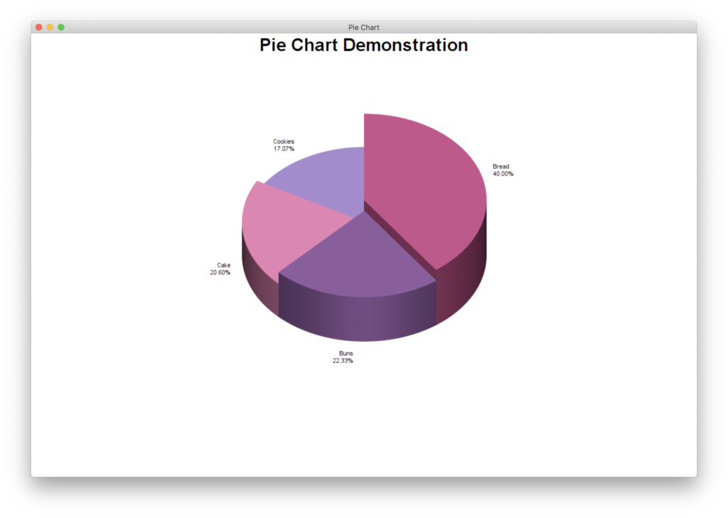
With Shadow Mode (2) and without Shadow Mode (3)
We prefer that the angle of the first segment does not start straight up, for this we use the SetStartAngle method. Also, the individual segments should not stick to each other and there should be a small gap between them. We want to highlight the largest segment a bit more and move it further out. In the SetExplode method we first specify the data segment we want to push out of the circle and the amount by which it should be pushed out:
c.setStartAngle(-20)
c.setExplode(0, 20)
c.setExplode(1, 20)
c.setExplode(2, 2)
c.setExplode(3, 2)
So that our data can also be displayed we have to pass the data to the diagram. With SetData we specify the data and assign the right labels to them. Both informations we find in the already prepared arrays:
c.setData(data, labels)
Our labels do not look handsome yet. We would like to change that now by defining their style. The label name should be italic, bold and a little bit bigger, than the other labels. Underneath it should be the given value in US$ and in brackets behind it the percentage value
The definition of this style is as given here in a format string:
c.setLabelFormat(“<*block,halign=left*><*font=timesbi.ttf,size=12,underline=0*>{label}<*/font*><*br*>US$ {value} ({percent}%)”)
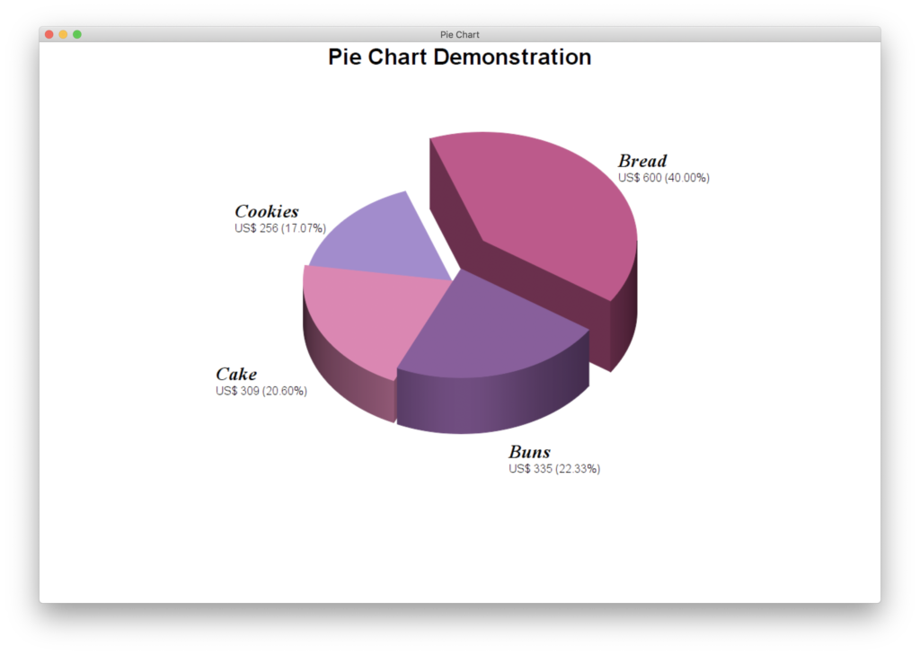
In the style sting we first define the text alignment. This should be left-aligned. Then we specify timerbi.ttf as font. This font is already italics and bold (recognizable by the b and i at the end). In addition, we specify the font size with 12 and that the text is not underlined. These specifications refer to the label text. This is specified with {label} in the style string. After a line break the text US$ and the value of the segment that is specified with {value} is following. In the default case it is assumed that the value is a number. But if it is a date we can format it with the following additions: {value|mm/dd/yyyyy}, {value|mm/yyyyy} or {value|yyyyy}. In our example, the percentage with {percent} in brackets follows.
If you want your segment description texts to be highlighted in the individual segment colors and have lines to the individual segments, you can add the following line:
c.setLabelLayout(c.kSideLayout)
Finally, we want to display our diagram in the window as a background picture. To do this, we adjust our window size to the size of the diagram. Then we create a picture with the method makeChartPicture, which we then set as the backdrop.
w.Height = c.getHeight
w.Width = c.getWidth
w.Backdrop = c.makeChartPicture
Of course we could have used the picture also to write it into a file. For this we can use the method Save in combination with a folder item or we could have used the picture to insert it into a PDF file with DynaPDF.
There are many more possibilities to design charts with Chart Director, but this example should give you a short insight to the work with Chart Director.
To use these functionalities you need a license of the MBS ChartDirector Plugin. You get it either in the Xojo store, on our website or currently in the OmegaBundle 2020.
I wish you a lot of fun with the charts in Xojo. Download the project.
Stefanie Juchmes studies computer science at the University of Bonn. She came in touch with Xojo due to the work of her brother-in-law and got a junior developer position in early 2019 at Monkeybread Software. You may have also read her articles in Xojo Developer Magazine.