
With the introduction of DesktopXAMLContainer you can slowly modernize your Windows apps or supplement your existing user interface with additional WinUI controls. If you are new to XAML, read my earlier post Introducing DesktopXAMLContainer to begin. In this tutorial I’ll demonstrate how you can do more with XAML.
Doing More With Layouts
While you can certainly add a single WinUI control in a DesktopXAMLContainer, you can also aggregate controls on the container to improve things. XAML makes it possible to customize the layout of your controls using mark-up instead of laying out your controls (one by one) on your window and adjusting the position by hand. Take for example a set of buttons that you want to layout vertically on your window. While you can certainly position three individual buttons on your layout, you could also accomplish this using one DesktopXAMLContainer with the StackPanel layout.
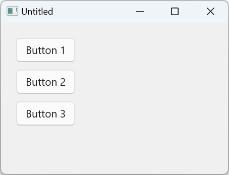
<StackPanel Orientation="Vertical">
  <Button Content="Button 1"/>
  <Button Content="Button 2"
           Margin="0,10,0,0"/>
  <Button Content="Button 3"
           Margin="0,10,0,0"/>
</StackPanel>
Without any dragging or dropping, you can re-configure this layout to be horizontal instead.
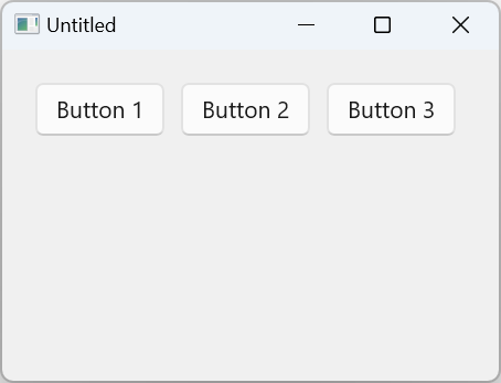
<StackPanel Orientation="Horizontal">
  <Button Content="Button 1"/>
  <Button Content="Button 2"
           Margin="10,0,0,0"/>
  <Button Content="Button 3"
           Margin="10,0,0,0"/>
</StackPanel>
Handling Events
In the case of a single WinUI button in a DesktopXAMLContainer, handling events is a simple check in EventTriggered for the “Click” eventName. With multiple buttons in a DesktopXAMLContainer, you will want to properly Name them to determine which button was clicked.
<StackPanel Orientation="Vertical">
  <Button Name="Button1" Content="Button 1"/>
  <Button Name="Button2" Content="Button 2"
           Margin="0,10,0,0"/>
  <Button Name="Button3" Content="Button 3"
           Margin="0,10,0,0"/>
</StackPanel>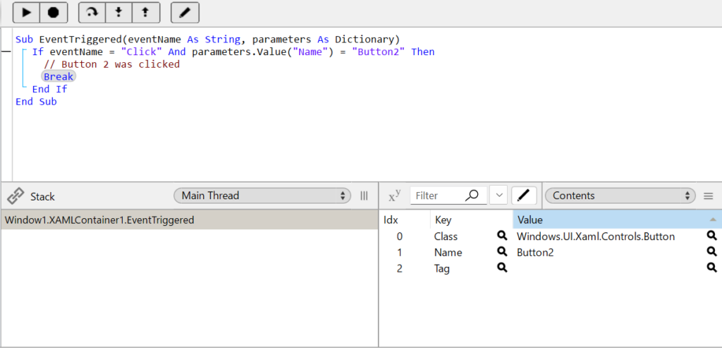
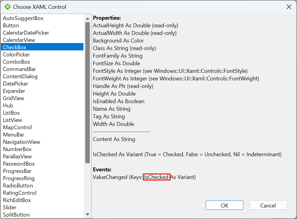
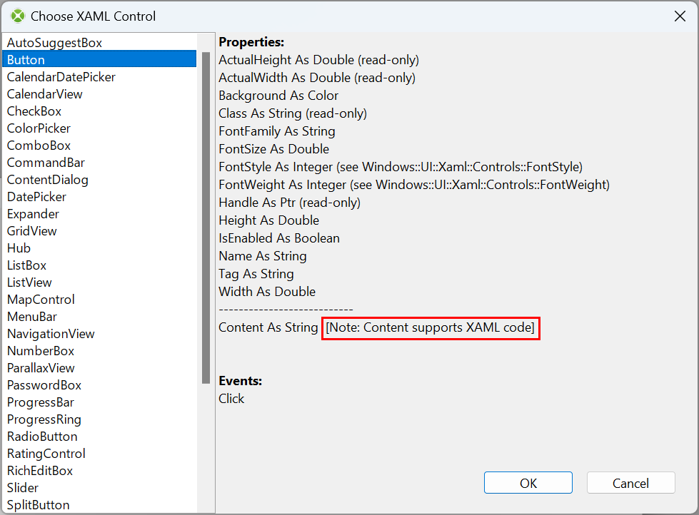
You can inspect the parameters Dictionary to see what other Keys are available for a particular control and event. All controls will have at least the three basic keys: the fully qualified XAML Class name, the Name of the control, and the additional Tag property. Some controls will have additional Keys populated in the Dictionary, for example the XAML CheckBox control will fire a ValueChanged event with an IsChecked Key available in the parameters Dictionary. The specific names for these Keys can be found in the XAML Control Chooser Window.
Doing More With Code Behind
There will be instances where you may want to setup your control dynamically in code. The available properties/methods that a particular XAML control supports in the XAML Control Chooser window are documented. These properties and methods can be accessed using the DesktopXAMLContainer’s Value and Invoke methods. Let’s take the simple example of a Button. While you could set this all up using just XAML code, there may be times that you want to only change the caption of the Button in code. To do this you can use the Value method:
XAMLContainer1.Value("Content") = "My new caption"Equivalently, you could also set this up using only XAML code:
XAMLContainer1.Content = "<Button Content='My new caption'/>"If you have multiple Buttons in your DesktopXAMLContainer (like in our StackPanel example above), you can reference the control using a fully qualified name space:
XAMLContainer1.Value("Button2.Content") = "My new caption"Conversely, if you wanted to know what the caption of Button3 is, you can use the Value to get it too:
myCaption = XAMLContainer1.Value("Button3.Content")Some Properties/Methods Support Embedded XAML Code
If you take a look at the Button Content property, we’ve documented it with a note about it supporting XAML code. This means you can insert XAML code instead of just a basic string. So if you wanted to embed a ProgressRing inside a Button you could add that using the Content property.
XAMLContainer1.Value("Content") = "<ProgressRing />"This would be the equivalent XAML code:
<Button>
  <ProgressRing />
</Button>
What is this winui namespace?
You may notice that some controls, added via the XAML Control Chooser window, use the winui namespace when you inspect the Content. Those particular controls are using the more modern UI look and feel. See https://learn.microsoft.com/en-us/uwp/api/microsoft.ui.xaml.controls
some controls offer the older style equivalent, see https://learn.microsoft.com/en-us/uwp/api/windows.ui.xaml.controls
One such control is the ProgressRing. If you prefix this with winui, you’ll get the updated look, while the previous iteration can be seen without the winui prefix.

<winui:ProgressRing />
<ProgressRing />Custom Binding
Xojo supports a new mark-up syntax called {XojoBinding} specifically to help with re-usability of XAML controls. This currently only binds at the layout/IDE layer, but can be useful for re-usability purposes. As in this example you can customize the look of a Button by changing some properties in the inspector.
To set this up you will need to subclass a DesktopXAMLContainer and add the properties you want exposed in the inspector.
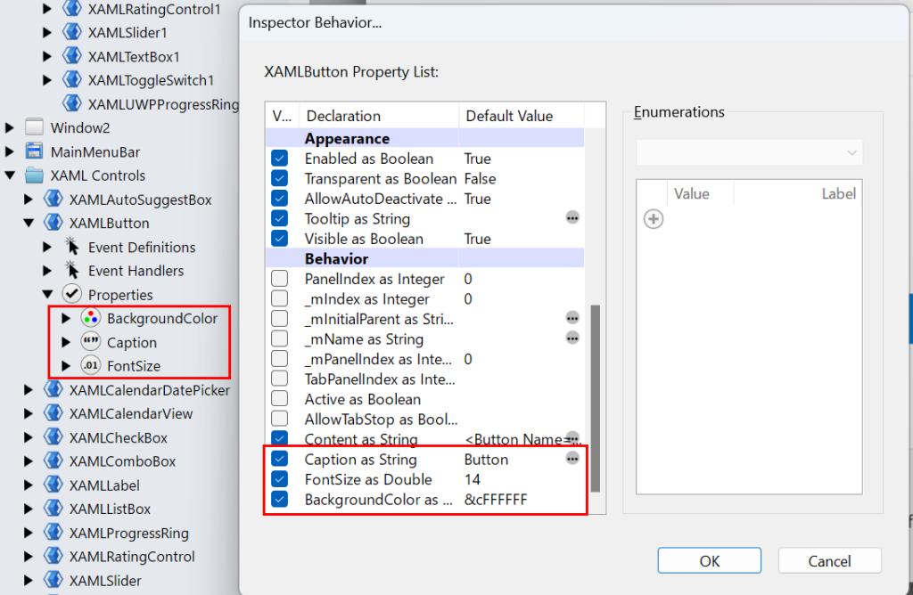
You will then need to add the necessary {XojoBinding} calls in the Content of your XAML:
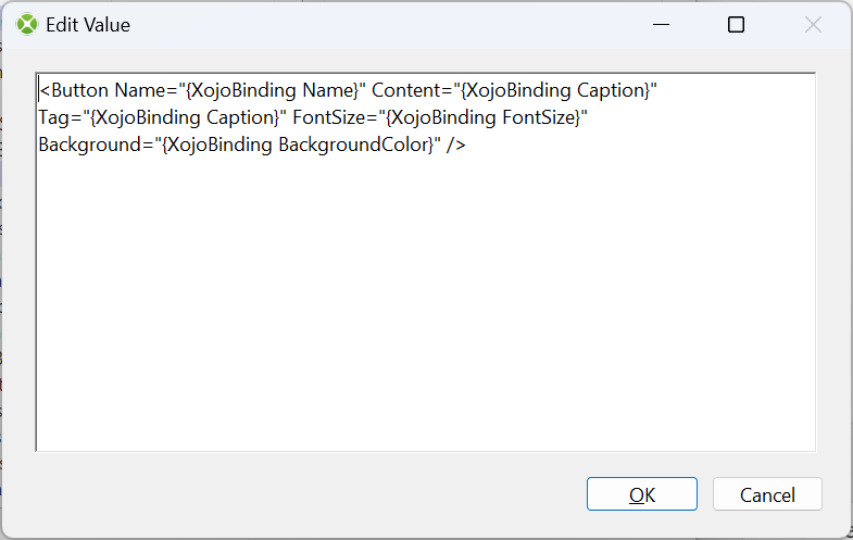
The syntax for binding to a XAML property is written as:
{XojoBinding [name of class property]}
And in this case it’s binding the Caption property that we just added and exposed via the Inspector Behavior, to the Content of the XAML Button.
This means a change to the Caption property in the Inspector will now update the XAML code to reflect this change and update the layout accordingly. For doing more with the DesktopXAMLContainer, make sure to check out the Example Projects included in the Examples folder of the Xojo Download, the Xojo Documentation.
William Yu grew up in Canada learning to program BASIC on a Vic-20. He is Xojo’s resident Windows and Linux engineer, among his many other skills. Some may say he has joined the dark side here in the USA, but he will always be a Canadian at heart.