
In Part 1, we built a custom button control in Xojo by subclassing DesktopCanvas. In Part 2, we enhanced it with customizable colors, corner radius, and a disabled state.
Now, let’s make the CanvasButton control even easier to use in the Xojo IDE by leveraging the Inspector Behavior feature. This allows you (and anyone using your control) to configure its appearance and behavior at design time, right in the Properties panel.
Why Inspector Behavior Matters
When you create a custom control, its custom properties will not appear in the Inspector by default. Inspector Behavior lets you choose which properties are shown and how they’re grouped. This makes your control feel polished and professional, and saves users from digging into code to tweak settings.
Step 1: Open Inspector Behavior
To customize Inspector options for your CanvasButton:
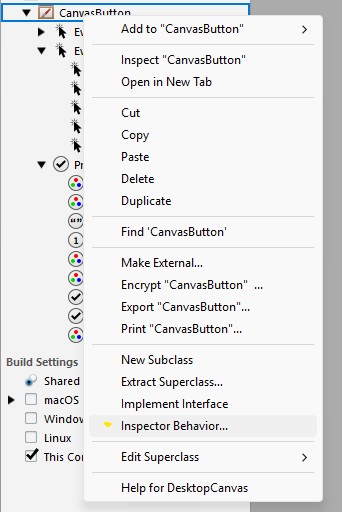
- In the Xojo IDE, select the
CanvasButtonclass in the Project Navigator. - Right-click it and choose Inspector Behavior…
Step 2: Expose and Organize Properties
In the Inspector Behavior dialog, you’ll see a list of all public properties (inherited and custom).
- Make the following properties visible:
ButtonTextCornerRadiusBackgroundColor,HoverColor,HighlightColor,BorderColor,TextColor(all grouped under a custom “Button Colors” section)
- Organize properties into logical groups for clarity.
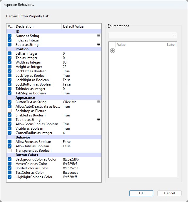
Tip: Defining default values for your properties in the class code means they will be automatically populated in Inspector Behavior. However, Xojo gives you even more flexibility. You can override these default values directly in the Inspector Behavior dialog, so you have full control over what new instances of your control will look like by default.
Step 3: Enjoy Design-Time Customization
With Inspector Behavior set up, you (or other developers) can now:
- Change the button text right in the Properties panel.
- Pick custom colors for normal, hover, pressed, border, and text states using the color picker.
- Adjust the corner radius visually.

Step 4: Best Practices and Tips
- Use clear group names (like “Button Colors”) to help users find related properties.
- Set sensible defaults for all properties in your code, but remember you can override them in Inspector Behavior.
Conclusion
With Inspector Behavior, your custom controls feel like first-class citizens in Xojo. You and others can now design beautiful, custom buttons by simply dragging, dropping, and tweaking settings in the Inspector. No code required!
Stay tuned for future parts where we’ll explore even more advanced features.
More in this series:
- How To Create a Custom Button Control in Xojo
- How To Create a Custom Button Control in Xojo – Part 2
- How To Create a Custom Button Control in Xojo – Part 3: Make Your Controls Inspector-Friendly
- How To Create a Custom Button Control in Xojo – Part 4: Adding Focus
- How to Create a Custom Button Control in Xojo – Part 5: Adding Text Alignment
Gabriel is a digital marketing enthusiast who loves coding with Xojo to create cool software tools for any platform. He is always eager to learn and share new ideas!