
In the first two blog posts, we saw how important it is to customize the NavigationBar when theming your iOS app. However, that’s only part of the equation, especially if your app also uses a TabBar. In that case, you’ll likely want to customize not only the background color of the TabBar, but also the text color of the selected tab and the color used for the unselected tabs.
Continue reading to learn how to do all of this thanks to the powerful flexibility of Declares!
Before we dive in, keep in mind that we’re building on the example project introduced in the first blog post of this series. If you haven’t read it yet, I encourage you to start there. Then, follow up with the second post to make sure you’re fully up to speed and ready to continue adding even more color customization to your iOS screens!
Background Color for the TabBar
In order to colorize the TabBar background, we need to add a new method to the “DeclaresForiOS” Module using the following values:
- Method Name:
TabBarBackgroundColor - Parameters: Extends tab As
iOSTabBar, Assigns value AsColorGroup - Scope: Global
Add the following snippet of code in the associated Code Editor:
Var tabController As Ptr = tab.ViewControllerHandle

If value = Nil Then Return

Declare Function GetTabBar Lib "UIKit" Selector "tabBar" (obj As Ptr) As Ptr
Var tabBar As Ptr = GetTabBar(tabController)

Var colorPtr As Ptr = ColorGroupToUIColor(value)

Declare Function BarAppearance Lib "UIKit" Selector "standardAppearance" (obj As Ptr) As Ptr
Declare Sub ConfigureWithOpaqueBackground Lib "UIKit" Selector "configureWithOpaqueBackground" (obj As Ptr)
Declare Sub SetBackgroundColor Lib "UIKit" Selector "setBackgroundColor:" (obj As Ptr, value As Ptr)
Declare Sub SetAppearance Lib "UIKit" Selector "setStandardAppearance:" (obj As Ptr, value As Ptr)

Var appearance As Ptr = BarAppearance(tabBar)
SetBackgroundColor(appearance, colorPtr)

SetAppearance(tabBar, appearance)

If System.Version.MajorVersion >= 15 Then
  Declare Sub SetScrollEdgeAppearance Lib "UIKit" Selector "setScrollEdgeAppearance:" (obj As Ptr, value As Ptr)
  SetScrollEdgeAppearance(tabBar, appearance)
End If
Essentially, we’re setting the color by assigning it to the backgroundColor property of the appearance object associated with the TabBar.
Setting the Text Color
Now let’s add the code responsible for setting the text color of the selected tab in the TabBar. To do this, we just need to set the tintColor property. So, go ahead and add a new method to the “DeclaresForiOS” module with the following values:
- Method Name:
TabBarTextColor - Parameters: Extends tab As
iOSTabBar, Assigns value AsColorGroup - Scope: Global
And put the following snippet of code in the associated Code Editor:
Var tabController As Ptr = tab.ViewControllerHandle

If value = Nil Then Return

Declare Function GetTabBar Lib "UIKit" Selector "tabBar" (obj As Ptr) As Ptr
Var tabBar As Ptr = GetTabBar(tabController)

Var colorPtr As Ptr = ColorGroupToUIColor(value)

Declare Sub SetTintColor Lib "UIKit" Selector "setTintColor:" (obj As Ptr, value As Ptr)

SetTintColor(tabBar, colorPtr)
Setting Unselected Tabs Text Color
To set the text color for unselected tabs, we’ll need to use a few additional Declares. This is because the color must be applied to the normal state of the stackedLayoutAppearance object from the TabBar’s appearance. Additionally, we need to set the same value for the compactInlineLayoutAppearance, which is used when the device is in landscape orientation.
Add a new method to the “DeclaresForiOS” Module using the following values for its signature:
- Method Name:
TabBarUnselectedTextColor - Parameters: Extends tab As
iOSTabBar, Assigns value AsColorGroup - Scope: Global
And add the following snippet of code in the associated Code Editor:
Var tabController As Ptr = tab.ViewControllerHandle

If value = Nil Then Return

Declare Function GetTabBar Lib "UIKit" Selector "tabBar" (obj As Ptr) As Ptr
Var tabBar As Ptr = GetTabBar(tabController)

Var colorPtr As Ptr = ColorGroupToUIColor(value)

Declare Function BarAppearance Lib "UIKit" Selector "standardAppearance" (obj As Ptr) As Ptr
Declare Sub SetAppearance Lib "UIKit" Selector "setStandardAppearance:" (obj As Ptr, value As Ptr)

Declare Function StackedLayout Lib "UIKit" Selector "stackedLayoutAppearance" (obj As Ptr) As Ptr
Declare Function InlineLayout Lib "UIKit" Selector "compactInlineLayoutAppearance" (obj As Ptr) As Ptr
Declare Function NormalState Lib "UIKit" Selector "normal" (obj As Ptr) As Ptr

Var appearance As Ptr = BarAppearance(tabBar)
Var stackLayout As Ptr = StackedLayout(appearance)
Var inLayout As Ptr = InlineLayout(appearance)

Var normalState As Ptr = normalState(stackLayout)
Var normalInlineState As Ptr = NormalState(inLayout)

Declare Function NSClassFromString Lib "Foundation" (name As CFStringRef) As Ptr
Declare Function DictionaryWithObjectForKey Lib "UIKit" Selector "dictionaryWithObject:forKey:" (obj As Ptr, value As Ptr, key As CFStringRef) As Ptr

Var dict As Ptr = DictionaryWithObjectForKey( NSClassFromString("NSMutableDictionary") , colorPtr, "NSColor")

Declare Sub SetTextAttributes Lib "UIKit" Selector "setTitleTextAttributes:" (obj As Ptr, value As Ptr)

SetTextAttributes(normalState, dict)
SetTextAttributes(normalInlineState, dict)
SetAppearance(tabBar, appearance)

If System.Version.MajorVersion >= 15 Then
  Declare Sub SetScrollEdgeAppearance Lib "UIKit" Selector "setScrollEdgeAppearance:" (obj As Ptr, value As Ptr)
  SetScrollEdgeAppearance(tabBar, appearance)
End If
Testing the TabBar Color
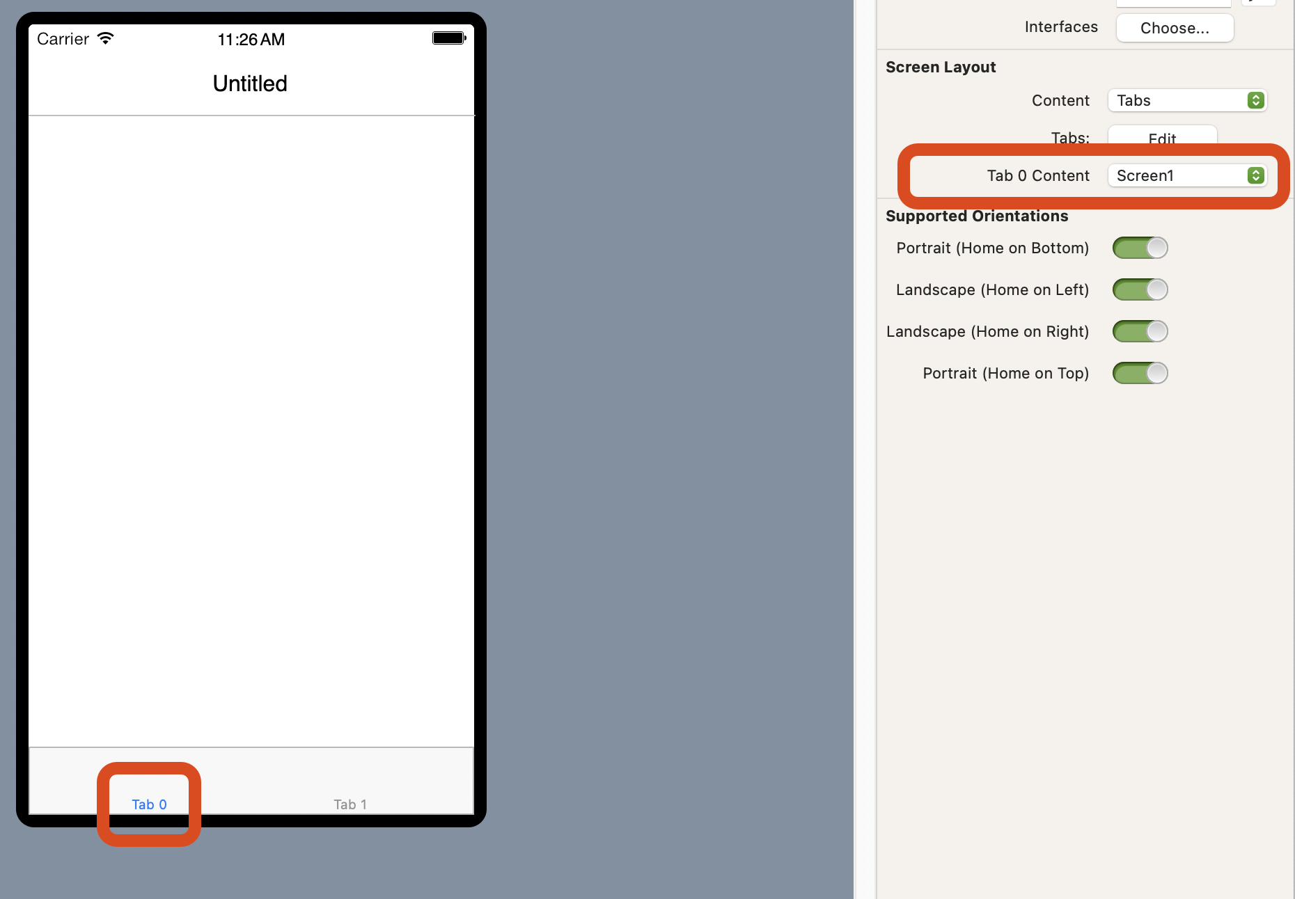
Add a new screen to the project so that our example app includes at least two screens. You can do this by selecting Insert > Screen from the IDE toolbar.
To test the new methods, we need the app to use a TabBar. To enable that, select the iPhoneLayout item in the Navigator. Then, in the Inspector Panel, locate the Content label and choose Tabs from the associated popup menu. Finally, set Screen1 as the content for Tab 0 using the “Tab 0 Content” popup menu.
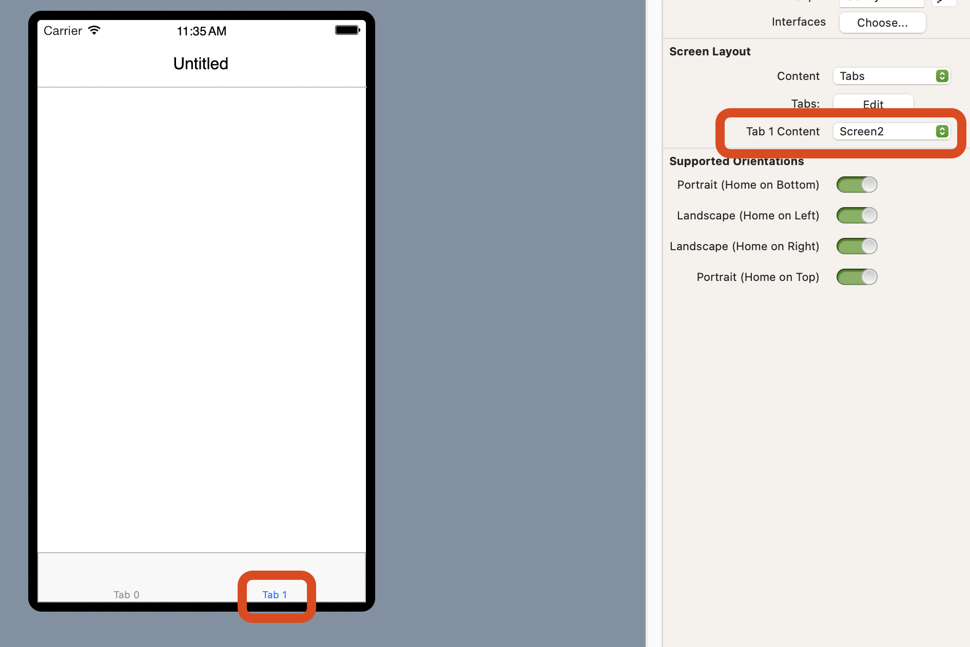
Next, with Screen1 still selected in the Navigator, click on the “Tab 1” label in the Layout Editor. Then, in the Inspector Panel, use the popup menu next to the “Tab 1 Content” label to select Screen2.
With Screen1 still selected in the Navigator, add a new property to it using the following values:
- Name:
MyTabBarUnselectedTextColor - Type:
ColorGroup - Scope: Protected
Now select the Screen1.Opening event handler and add this line of code:
MyTabBarUnselectedTextColor = New ColorGroup(Color.White, Color.LightGray)As the last step, select the Screen1.AppearanceChanged event handler and add this line of code:
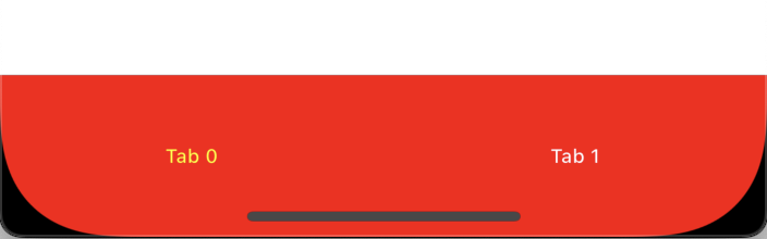
Me.ParentTabBar.TabBarBackgroundColor = mNavigationBarColor
Me.ParentTabBar.TabBarTextColor = MyNavigationBarTextColor
Me.ParentTabBar.TabBarUnselectedTextColor = MyTabBarUnselectedTextColor
All set! Now it’s time to run the example project in the Simulator or on your iPhone. You’ll see that the TabBar background color matches the one set for the NavigationBar, and the selected tab text color is consistent as well. The unselected tab text appears white in Light Mode and light gray in Dark Mode, reflecting the ColorGroup settings.
As we’ve seen, Declares are a powerful way to tap into native iOS framework functions and routines. The most challenging part is often figuring out which ones to use since that requires digging into Apple’s developer documentation.
Download the example project from this link.
Happy Xojo coding!
Javier Menendez is an engineer at Xojo and has been using Xojo since 1998. He lives in Castellón, Spain and hosts regular Xojo hangouts en español. Ask Javier questions on Twitter at @XojoES or on the Xojo Forum.