
Xojo is a modern, powerful programming language with an IDE that simplifies all kind of tasks related your project creation and deployment. One such helpful feature is the UI layout design; you can find it under the Library Panel, it’s a meaningful collection of graphic classes (Controls) ready to use in our apps. Probably one of the first and most used controls in apps design is the TextField, TextField simplifies the way an app can get the input from the user. Let’s see its main properties and how this control behaves when used in Desktop, Web (WebTextField) and iOS (iOSTextField) apps!
You can watch the video (in Spanish, with English subtitles) as you read and work through this post.
It’s all about the content: Text
The main property of the control is the Text property. Accessing this property we can get the text typed by the user of the app…or set the text that we want the control to show (using Text or String data types). This property is available for all the supported platforms without variations.
Obviously, we can set the text shown by the control by default using the Initial State section of the Inspector Panel. Here is where we can find the CueText property for Web and Desktop apps, or the PlaceHolder property for iOS apps. Anyway, the text put here will be shown as ghost text by the control when there is not text entered from the user, giving a hint to the user about the kind of input data our app expect to be entered in the control instance.
Optionally, the Desktop and Web implementations of this control also offer the HelpTag property. Here is we can enter the text to be show to the user as a little help about the control purpose. This text will be automatically shown when the user puts the mouse pointer over the control during a second or so.
Give me the Password
Sometimes it’s very convenient to use the boolean property Password. Once enabled, the TextField will hide the control content from prying eyes, using a series of dots instead of every one of the typed characters. This is, in fact, the way to go when we need that the user of the app enters a Password or any kind of sensible data that shouldn’t be exposed otherwise.
As it happens with the Text property, the Password property is available for the creation and deployment of Desktop Apps (macOS, Windows, Linux, Raspberry Pi), web and native iOS apps. The only difference is that, for web apps, the TextField control will offer the option to save the password for later retrieval, something that only is available for that web browsers that support this feature (as it is with Safari under macOS). For iOS apps, the password behaviour will be the one we can expect from a native iOS app, showing in a fast succession the tapped key and hiding it in the blink of a eye.
TextField appearance
When it’s about the properties related mainly to the appearance of the text shown by this control, we can set several properties under the Attributes Inspector Panel for Desktop apps, as for example the Type, text Size and Style, as its the case when using this control in iOS apps. In addition, we can use the main area of the Properties Inspector to change the text alignment, text color and also the background color (only for Desktop apps, not in the case of iOS apps).
When it’s about web apps, all the issues related with the text style are related with the assignment of a Web Style that we have had defined previously, and whose creation and assignment is pointed in the video accompanying this blog entry.
When using this control on Desktop apps we can also set other appearance attributes, for example, the use of a border (it is not possible to assign the border color and/or border thickness), the use of the focus ring that points out the control active to receive the user keyboard input, and the feature already exposed that allows us to define the control background color; something that is also possible when using the control with Web apps, via the associated property during a Web Style definition.
How to limit the text length
There are several ways to limit the length of the text that the user can type on a TextField, mainly by kind of data or number of characters. The simpler is obviously the second option, available when using the TextField on Desktop apps and Web apps, via the LimitText property.
Applying format to the Text
There are countless the kind of apps where we would want to apply a specific format to the text typed by the user, and in fact we can turn again to the TextField properties to find the way to do it! However, we will have more or less flexibility if we are dealing with a Desktop app, a Web app or an iOS app.
Desktop
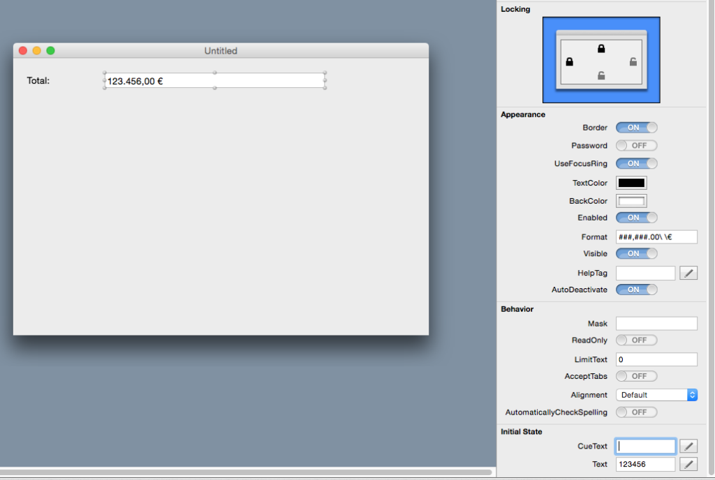
For example, when using a TextField with Desktop apps (macOS, Windows, Linux), we can use the Mask property to apply an specific format to the typed data. In these cases, the format will be applied once the control loses its focus. For example, the following format sequence applied in the Mask property:
###,###.00\ \€
will automatically format the number “123456” as:
123.456,00 €
Notice that even if we use the English notation (the comma as thousands separator and the dot as decimal separator), our app will apply the regional settings configured on the computer that runs the app. I mean, it will format correctly the string using the appropriate regional settings on every case.
Web
In this case we could talk about a combination between text format and text restriction. For that, we can choose any of the options available under the popup menu Type under the Appearance section of the Inspector Panel:
- Normal. The WebTextField will show any typed text.
- Password. It will behave as explained under the Password section, hiding the typed text.
- E-mail Address. The control will show an error ring if the typed text doesn’t seems to be a legal e-mail address. For that, it only seeks for the presence of the ‘at’ symbol (‘@’) and a dot character (‘.’) in the entered text.
- Number. The control will show an error ring if the typed content is not exclusively numeric. This is something similar to the example we have seen with the Mask in a Desktop app, except that in this case the control adds a couple of graphical widgets that allows us to increase or decrease the TextField value when clicking on them.
- Telephone Number. At first, this option should accept only the input of a legal phone number, but in practice it will admit any kind of data.
- URL. As it happens with the previous item, it should admit and show just the kind of data for a legal URL, but in practice it will admit any text composition.
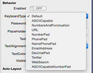
iOS
In this case it is mainly about setting the kind of keyboard shown to the user once he taps on the TextField, where we can choose the most adequate for numeric values, URL, e-mail or general text, between some of all the available options.
So that’s the TextField control. You can watch the video (in Spanish, with English subtitles) that talks you though this example. And remember, when you have questions visit the Xojo Dev Center for documentation, examples, tutorials and more. Or ask the Xojo community on the Forums.
Javier Rodriguez has been the Xojo Spanish Evangelist since 2008, he’s also a Developer, Consultant and Trainer who has used Xojo since 1998. He is in charge of AprendeXojo.com and the developer behind the GuancheMOS plug-in for Xojo Developers and the Snippery app, among others.