
Composing new controls using primitives is something you definitely want to explore. Let’s build a reusable vertical navigation, with animations, for your Xojo Web projects.
Brief introduction to the Atomic Design Methodology
If you haven’t heard about Atomic Design before, I really recommend that you dig a bit into this topic. With this way of methodology in mind, we will start building the smallest controls we can. Then, we will compose more complex controls reusing the smallest.
Keep in mind you don’t really need to blindly follow the Atoms, Molecules and Organisms proposed categories, and don’t overthink where to categorize them. As long as you can compose controls with other controls, that’s perfect. Adapt it to your own personal way of building software.
The idea resonates perfectly with Xojo and, while we will create a few web controls in this example, you can apply it to other targets like Desktop or Mobile.
Here is a video from Brad Frost, the person behind Atomic Design Methodology.
Containers to the rescue!
In this case, we won’t need to use any Web SDK control, CSS or JavaScript. We will be using just plain Xojo Web Containers for creating our Atoms and Molecules.
This is how Twitter’s navigation sidebar looks like:
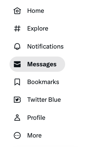
We will create something similar. Using Atomic Design, let’s break it down it into a few new reusable controls:
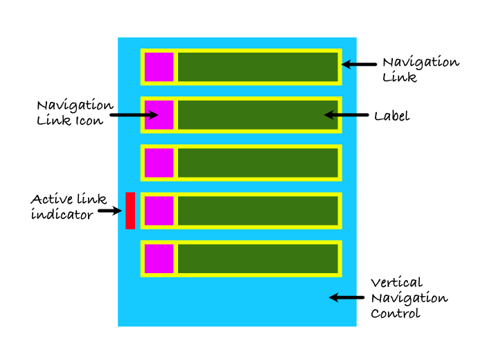
Each Atom, Molecule and Organism will be a Container. In the above image, we have identified each of them.
- There is a “Navigation Link Icon”, an Atom, which will show one of the available Bootstrap Icons. As you notice in the Twitter example, if the link is active, the icon will be filled.
- For the label Atom, we can just use the WebLabel built-in control. There is no need to wrap it in a Container, in this case.
- The navigation link will be a Molecule, combining the icon and the label.
- The Active Link Indicator will move to the active link, using an animation.
- Finally, the Vertical Navigation Control will be the Organism, combining everything into one.
Navigation Link Icon
This Control is basically a Container, with an ImageViewer inside. Technically, this could be just an ImageViewer subclass, but using a WebContainer we can also specify its default width and height.
It will have two computed properties:
- Active As Boolean
- IconName As String
There will also be a private ShowIcon method. Whenever you change either the Active property or IconName, the computed property will call ShowIcon.
The magic is inside ShowIcon:
Var iconColor As Color = If(mActive, Color.Black, Color.LightGray)
Var icon As String = If(mActive, mIconName + "-fill", mIconName)
IconImageViewer.Picture = WebPicture.BootstrapIcon(icon, iconColor)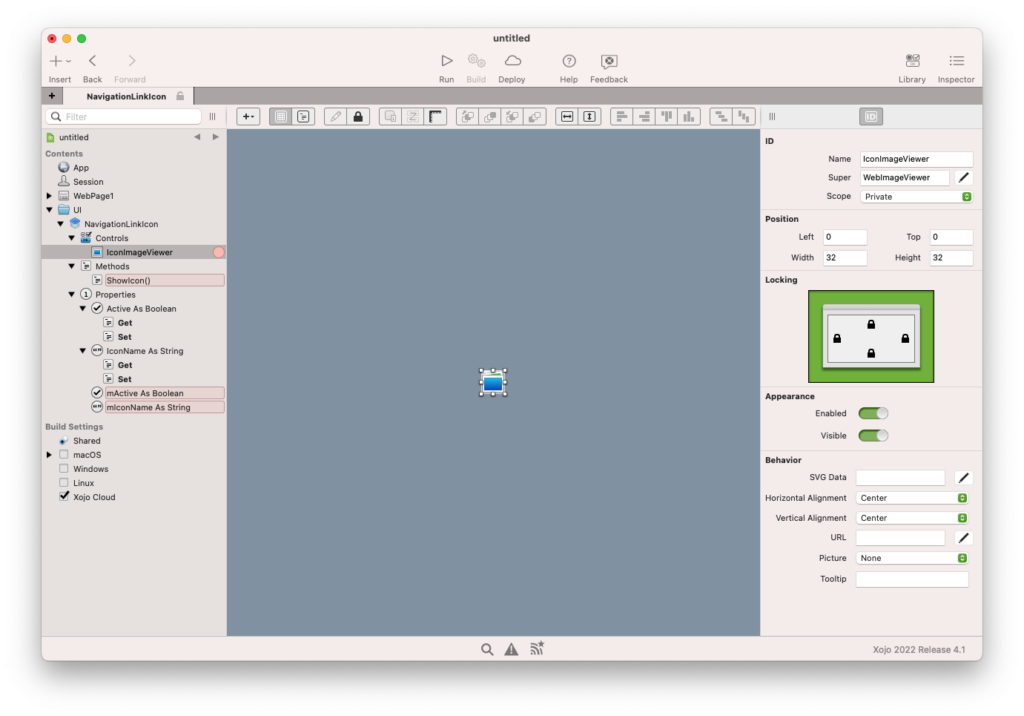
The icon color will be either LightGray or Black, depending if it’s active or not. There are also a lot of Bootstrap Icons with the “-fill” suffix so we’ll use them. This will force us to only use icons which have that suffix, but we will have to live with that.
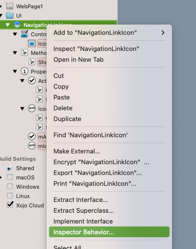
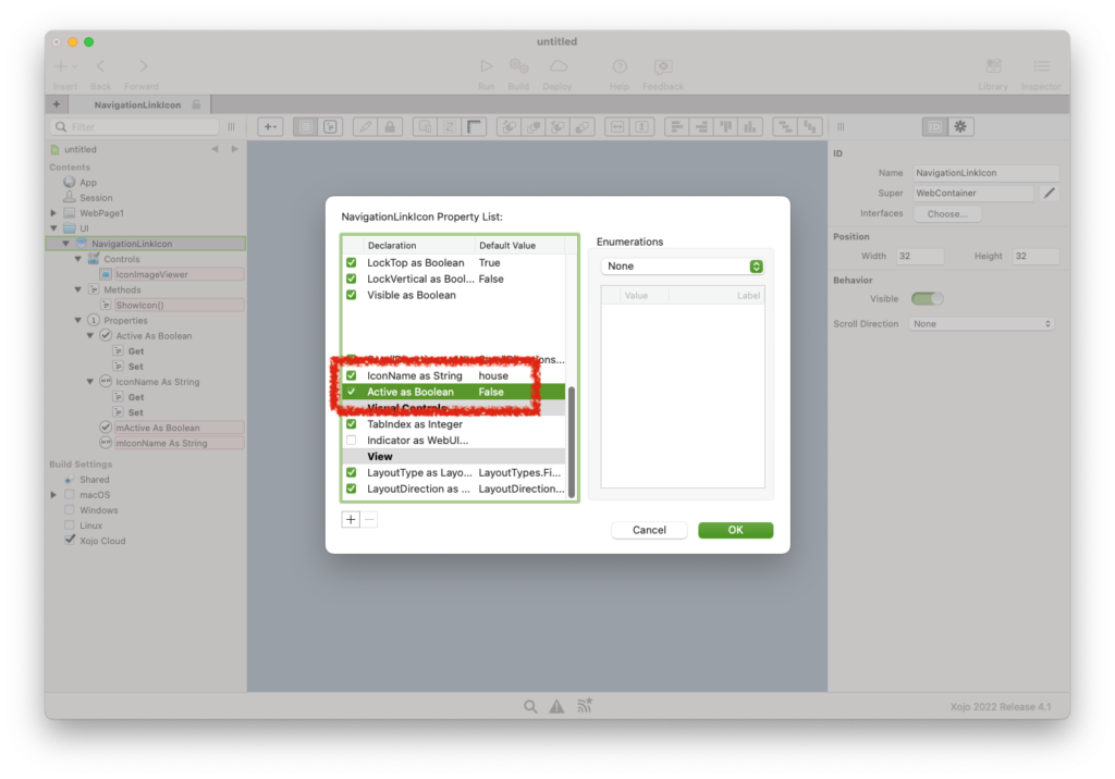
The final trick is to use the Inspector Behavior and expose our Active and IconName computed properties. Right click on NavigationLinkIcon, then click on Inspector Behavior:
From there you can enable the checkboxes and define their default value:
Now that we have the Control ready, let’s see how it works on its own:
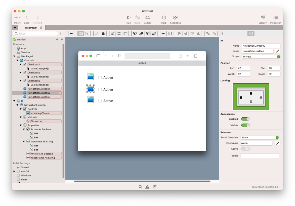
Neat! You can reuse this Atom everywhere, including other projects.
Navigation Link Control
Combining our fresh NavigationLinkIcon, a built-in WebLabel and exposing an API, we’ll create our NavigationLink Molecule.
Create a new Container and place the items inside. Then add some computed properties:
- Active
- Caption
- IconName
Whenever the property changes, just update the underlying control.
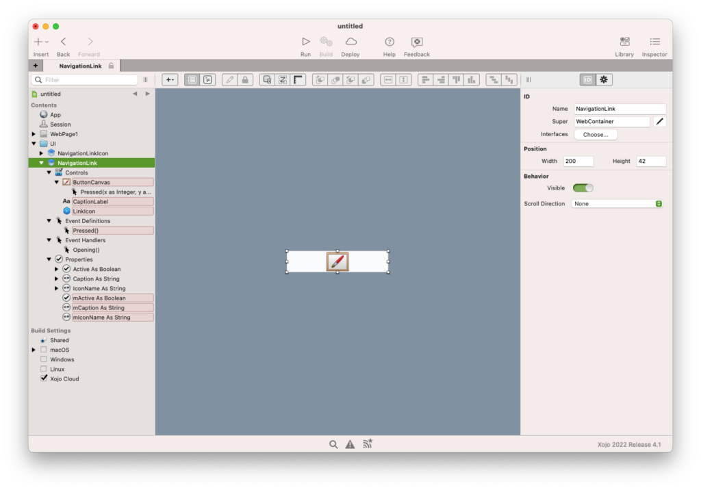
One trick, to make the control clickable, is to add a WebCanvas on top of the other controls. Implement its Pressed event and forward it as a new “Pressed” Event Definition.
If you want to show a pointer cursor when the user moves the mouse over your control, add this line of code into the container’s Opening event:
Me.Style.Cursor = WebStyle.Cursors.PointerThis is how it looks like in the IDE:
Let’s quickly test it:
We are getting there.
Active Link Indicator
We have most of the Atoms and Molecules created already. The Navigation Link Indicator is so simple and so tied to the Sidebar, that I don’t think creating an individual Atom for it is worth the effort.
Using a WebRectangle, with a line of two of code in its Opening event, will be enough. This is completely up to you!
Vertical Navigation Control
Now it’s time to glue the Atoms and Molecules together to make our first Organism. Create a new Container called VerticalNavigation.
Drop a WebRectangle on it. Set its Left and Top to 0, and implement its Opening event with these lines of code:
Me.Style.BorderThickness = 0
Me.Style.AddTransition("top", 0.2)
That will remove the border that comes by default with this control. It will also tell the browser to animate the rectangle whenever we change the Top position.
The rectangle background color will be a light gray, but this is again up to you.
For the API we want to expose, add these Methods:
- AddLink(caption As String, icon As String, active As Boolean = False)
- HandleLinkPressed(sender As NavigationLink)
- SetActiveLink(index As Integer)
AddLink and SetActiveLink can be left Public, HandleLinkPressed will be a Private Method.
AddLink code:
// We will create a new NavigationLink instance
// and set the properties we're receiving.
Var link As New NavigationLink
link.Caption = caption
link.IconName = icon

// For its pressed event, we will handle it
// internally in the HandleLinkPressed method.
AddHandler link.Pressed, WeakAddressOf HandleLinkPressed

// We will place it programatically in  the container.
Const padding = 10
Var linkTop As Integer = mLinks.Count * (link.Height + padding)
link.EmbedWithin(Self, padding, linkTop, Self.Width - padding, link.Height)

// A reference for this NavigationLink will be
// needed later, so we will store it internally.
mLinks.Add(link)

// Finally, if the item is active, we will
// handle it just like if it's been pressed
// by the user.
If active Then
  SetActiveLink(mLinks.LastIndex)
End If
HandleLinkPressed code:
SetActiveLink(mLinks.IndexOf(sender))
RaiseEvent Pressed(sender)
And, finally, SetActiveLink:
// Here we will loop through the NavigationLink
// references we have and enable or disable the
// Active property, depending on the index
// comparison.
For i As Integer = 0 To mLinks.LastIndex
  mLinks(i).Active = i = index
Next

// Move the visual active indicator to the
// NavigationLink position.
ActiveLinkIndicator.Top = mLinks(index).Top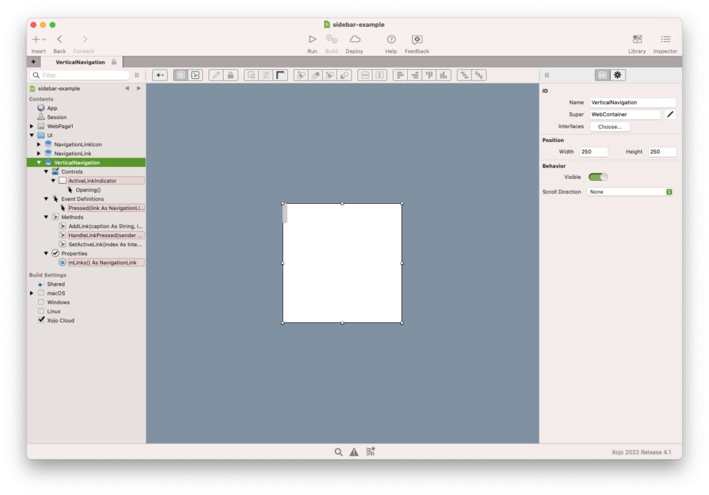
Final Result
Everything is ready, drop your VerticalNavigation somewhere in your WebPage and add a few links inside its Opening event:
// Setting the third parameter to "True" will set that link as Active.
Me.AddLink("Home", "house")
Me.AddLink("Explore", "binoculars", True)
Me.AddLink("Notifications", "bell")
You should see something similar to this:
Congratulations! You’ve built a vertical navigation, with nice transitions, using some Atomic Design principles.
Code repository: https://github.com/piradoiv/vertical-navigation-example
Download the project: vertical-navigation-example
Ricardo has always been curious about how things work. Growing up surrounded by computers he became interested in web technologies in the dial-up connections era. Xojo has been his secret weapon and language of preference since 2018. When he’s not online, chances are he will be scuba diving … or crocheting amigurumis. Find Ricardo on Twitter @piradoiv.