
30 years ago this past January, Apple launched the Macintosh and with it, the first widely available computer with a Graphical User Interface or GUI. If you are less than 25 years old, there’s a very good chance you’ve never used a computer that didn’t have a graphical user interface. But at the time, it was a radical departure from the way in which most people interacted with a computer. Over the past 30 years, the GUI has evolved and in some ways has come full circle.
In the Beginning
In 1984 when the original Macintosh was introduced, as advanced as its interface was at the time, its graphics capabilities were extremely weak, at least by today’s standards. It could only manage a black and white, 1 bit interface.


Over time, the graphics capabilities of personal computers became stronger. Processors, memory and displays all became better, faster and less expensive. Consider Windows 95 (released in 1995) and Mac OS 8 (released in 1997):


The Mobile User Experience
When the iPhone came along, it took the mobile interface to an entirely new level. One of the things Apple realized is that when using an interface on a much smaller screen, you have to simplify. The busier the user interface, the harder it is to use. This meant fewer lines and simpler graphics. It also meant being more choosy about the functions apps would perform because of the limited space available in such a small screen (among other things). The simpler user interface allowed the user to focus.
Android has gone through the same transition over the years, from Cupcake yo KitKat.
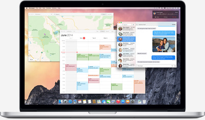
The Changing Desktop
In some ways, this didn’t start with iPhone and Android. For example, for years many graphics and photo-editing applications have used a dark theme so that the application’s interface fades into the background helping the user focus on their content.

Now Apple, with the upcoming release of OS X 10.10 Yosemite, is simplifying the user interface as well. You can click to enlarge the picture below.
But in Apple’s case, I believe the motivation is more about simplifying for two reasons:
1) The simpler the visual aspects are, the more the user can focus on their content. Apple is not removing functionality. The change is more about how they render the user interface itself. There are fewer lines and fewer colors.
2) While Apple firmly (and rightly, IMHO) believes that you can’t have the exact same user experience on a mobile device as a desktop, there are visual cues that can be shared which make it easier for the user to switch between devices- icons for sharing, etc. Switching between desktop and mobile devices is a behavior that is very common and only becoming more so.
Coming Full Circle
In some ways we have come full circle. We started with simple user interfaces that were skeuomorphic and became even more so over time. At the time, they had to be because the user needed to relate the user interface to the real world. The Graphical User Interface has been around long enough now that it no longer needs to be skeuomorphic. Today, user interfaces need to make sense to users who already have experience with a graphical user interface. The simplified user interface makes the user experience more friendly and allows the user to stay more focused on what they are trying to accomplish. In subtle ways it increases productivity which, after all, is why we use computing devices in the first place.