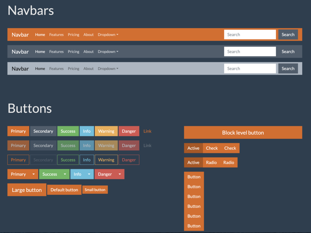
One of the big changes in Web Framework 2.0 is that web styles are no longer the primary means of styling controls. Instead, themes are used to provide a single, consistent look and feel across the entire application. We made this change because dealing with individual styles became more complex and unwieldy as projects grew bigger. Themes simplify this dramatically.
Themes
Xojo now uses Bootstrap themes, one of which is built-in and used by default. These themes control the entire appearance of all controls from sizes, to colors, to whether or not corners are rounded and more. There are a lot of publicly available Bootstrap themes so if you don’t care for the built-in one, you can find one on the Internet you like and simply drop it into your project to have it automatically replace the default theme. You can find high-quality, free and Xojo-compatible themes at bootswatch.com. Click the Preview button for any theme on that site to see what parts of the appearance of controls will change.
To use one of the the themes at Bootswatch.com, click the Download button’s menu (not the button itself) and choose the file titled bootstrap.min.css. That’s the only file you need and it must have that file name to work in Xojo. Once you have downloaded your theme, drop it into your project to use it.
Here’s just a tiny sample of the preview of the Superhero theme:

Customizing Individual Controls
This doesn’t mean you can’t customize individual controls. You still can. Some have properties available you can set in the Inspector but all have a Style property that can be changed via code. You can change background color, border color, border thickness, drawing color, opacity as well as font information such as the font itself, size, bold, italic, and strikethrough. You can even add animation through CSS transitions. If you have experience in CSS, you can set just about any property using the Value method.
Transitioning Control Appearance from Web Framework 1.0 to 2.0
Big transitions are rarely easy. However, the bigger your project is, the more time you’ve likely spent creating dozens of styles and then applying them to many of your controls. Themes solve this problem. You choose a theme, drop it in and the appearance of controls across your entire project is updated. If you are building an app for an organization that already has specific colors and appearance standards in place, using themes in Xojo makes it easy for them to provide you a theme that you can drop in to make sure the app you create for them matches those standards.
