
Based on user feedback, we added new functionality to the Chart control for Desktop, Web and iOS. Xojo 2024r2 includes inline labels for Pie charts, more rendering options and full DarkMode support. You will also find fixes to a bunch of Chart related bugs.
DarkMode
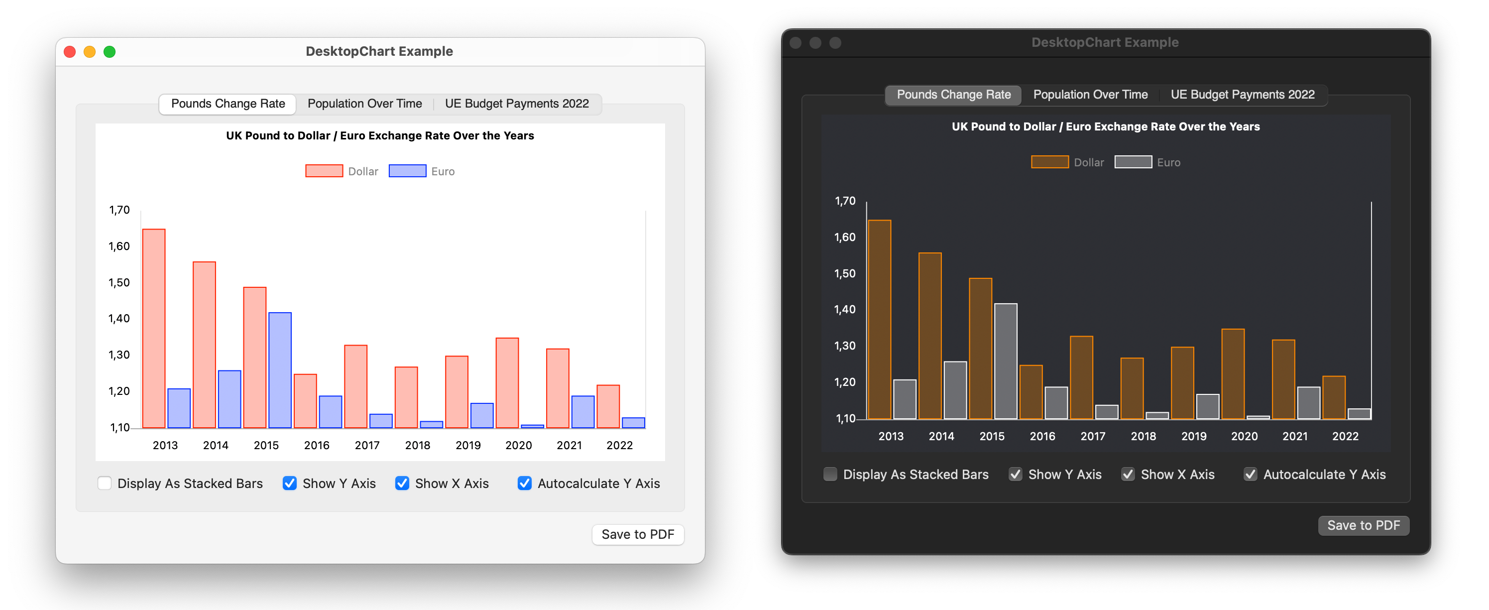
All of the chart types now have the ability to render themselves properly in both light and dark modes. For that to happen, using different colors for data representation when the light or dark modes are enabled, all you need to do is assign ColorGroup instances instead of Color values when creating the DataChart instance.
For example, this snippet of code will create two data sets using ColorGroup instances for the values:
Var dsInflaction As New ChartLinearDataset("Dollar", New colorGroup(Color.red, Color.orange), True, dollar)
Var dsTemp As New ChartLinearDataset("Euro", New colorgroup(Color.blue, Color.white), True, euro)
And this is how it is rendered in light and dark modes:
More Grid Flexibility
We added three new properties the the Chart control itself to better handle the way you want the chart grid to be rendered:
- IsGridVisible
- IsYAxisVisible
- IsXAxisVisible
For example, in previous releases you needed to set the GridColor property to Color.Clear to avoid the drawing of the grid lines in the chart. Now, you can set the GridColor to any other color you (or your app user) may want, and simply control if the grid is rendered or not setting the IsGridVisible property to the True/False boolean value.
In addition to the grid itself, you have the flexibility to decide if the rendered chart will display the X or the Y axis along their values through the IsXAxisVisible and the IsYAxisVisible boolean properties. As with the IsGridVisible property, you can change these values at runtime and the chart will be updated accordingly:
Inline Labels
Also, starting with Xojo 2024r2, for all the chart representations based on a ChartCircularDataset, you will be able to decide if you want the Labels to be rendered inline in addition to these rendered by default in the upper section of the chart, or instead of these. This can get a better identification of the label representing every Pie chart section, requiring less screen space.
In order to display the Inline labels all you need to do is set the ChartCircularDataset.HasInlineLabels property to True.
Conclusion
As always, we look forward to keep improving Charts and see how do you use them in you Xojo developed apps and solutions!
Javier Menendez is an engineer at Xojo and has been using Xojo since 1998. He lives in Castellón, Spain and hosts regular Xojo hangouts en español. Ask Javier questions on Twitter at @XojoES or on the Xojo Forum.