
DesktopChart, MobileChart, and WebChart have received some new features and improvements based mostly on user feedback. New features include a new Stacked chart type, more customization options for the already supported chart types and improvements to the chart control itself. Continue reading to get the details about all these great new things in Xojo.
Stacked Chart Type
In addition to the already existing Line and Bar charts, you can now render Stacked charts using the same LinearChartDatasets objects set to Bar mode. It is also possible to switch between Bar and Stacked with the same data on the fly.
More Line Styles and Endings
Originally, the bullet ending was the only available option for Line charts rendered since we first introduced WebChart back in 2020, and for DesktopChart and MobileChart introduced in Xojo 2023r1. Now there are more options to choose from, including “None”, in order to further customize the look of a Line chart as well as Scatter and Bubble charts.
It is also possible to set the line mode to solid or dashed for Line, Scatter and Bubble chart types. This means that, in Scatter and Bubble charts, you’ll be able to connect the rendered data dots to provide more meaning to your charts.
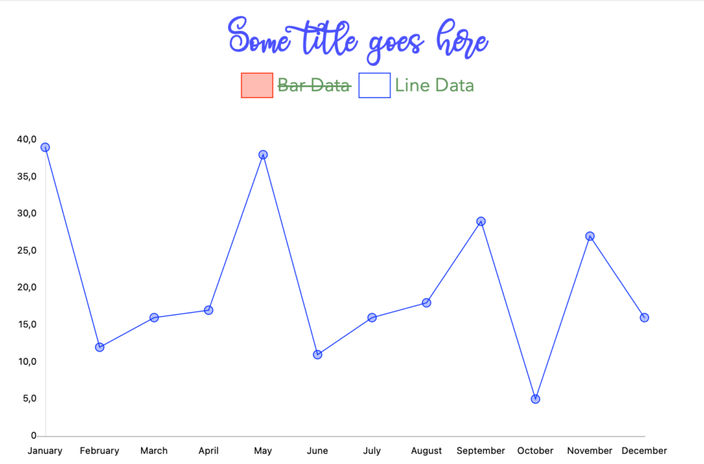
“None” is also now available as one of the style options for Line charts so you can render them with no connected end points. For example, the following snippet of code will create a new ChartLinearDataset with the line ending set to dross and the line type set to dashed:
Var data2() As Double

For i As Integer = 1 To 12
  data2.Add(System.Random.InRange(5, 40))
Next
Var myset As ChartLinearDataset = New ChartLinearDataset("Line Data", Color.Blue, True, data2)

myset.Style.EndPoint = ChartLinearStyle.EndPoints.Cross
mySet.Style.Line = ChartLinearStyle.LineTypes.Dashed
Me.AddDataset(myset)
More Customization Options
In previous releases, the font name, font size and font color were common to the drawing of all the strings in the chart. Now you can set different attributes for Title, Legends and Axis in order to further customize the look of your charts. For example, in a single chart you can set one font and text color for the Title and an entirely different font and text color for Legend and Axis.
Additionally, it is now possible to set prefix and suffix values to be used along the Y axis. It is also possible to use the Format property to format the Y axis values. The placeholders and syntax used in the expected Format string are the same you are familiar with in other areas of the Xojo framework when working with Strings.
Watch a related video New Features and Improvements for Charts and visit the Xojo Documentation for more on DesktopChart, MobileChart, and WebChart.
Javier Menendez is an engineer at Xojo and has been using Xojo since 1998. He lives in Castellón, Spain and hosts regular Xojo hangouts en español. Ask Javier questions on Twitter at @XojoES or on the Xojo Forum.