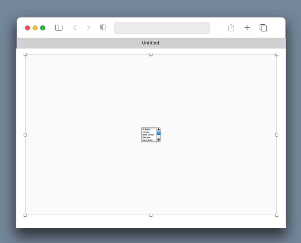
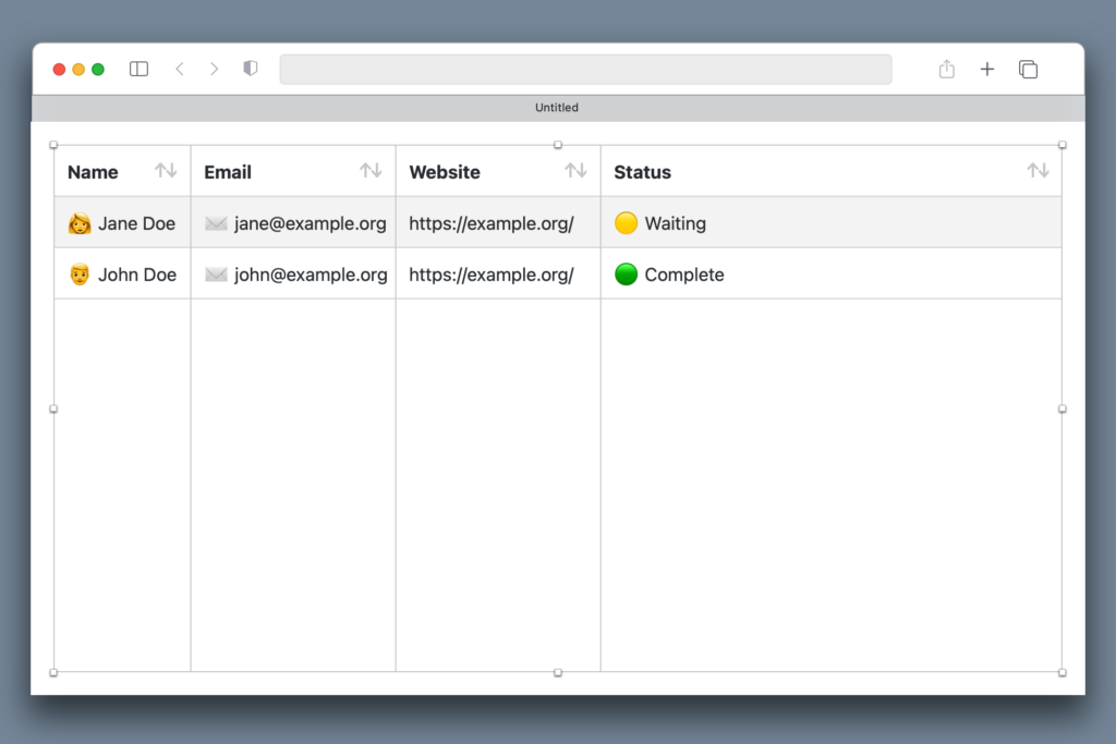
Xojo 2022r4 includes a much improved WebListBox preview in the Layout Editor. Now you can get a closer, truer look at your control when your project is run in a web browser.
Prior to Xojo 2022r4 the preview for WebListBox instances was a mere gray box with a small icon inside. This isn’t very helpful for visualizing how your design will look when the control is filled with data.
Now, you will get a preview that more closely resembles to the one provided by the ListBox in Desktop projects. That means the WebListBox preview will display the columns adjusted to the provided columns width and also the initial values (if any). Additionally, WebListBox will react to the change of width in the Layout Editor.


This improvement gives you a much better idea on how your WebListBox will look when the app is run in a browser.
Javier Menendez is an engineer at Xojo and has been using Xojo since 1998. He lives in Castellón, Spain and hosts regular Xojo hangouts en español. Ask Javier questions on Twitter at @XojoES or on the Xojo Forum.
