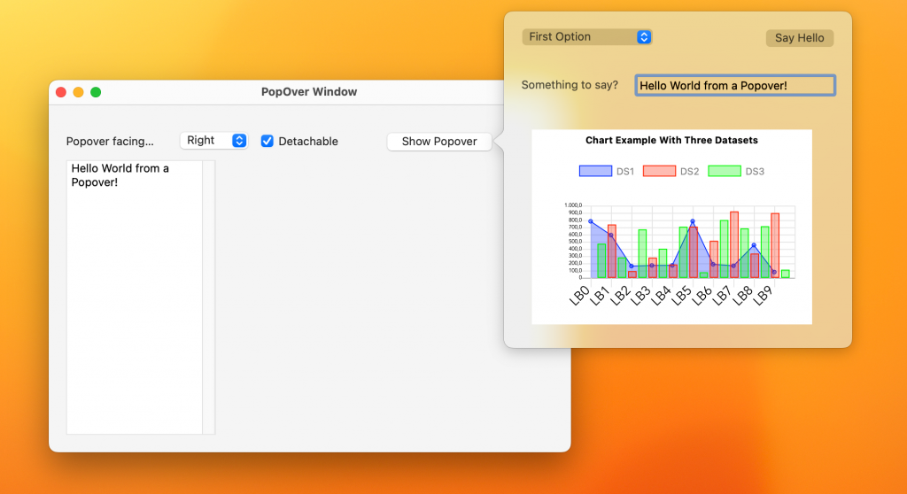
Starting with Xojo 2024r1 there’s a new Window type in Xojo’s UI/UX bag: Popovers. Popovers are kind of a Modal window with a more transient behavior and associated with a Parent control. A Popover will display the chosen content or layout, the same as when you design the user interface of a window or a Container control that will be included as part of another more complex design or displayed at runtime.

And what do we mean by the transitory character of Popover windows? Well, and here comes one of the first differences from Modal windows. When a Popover is visible and the user clicks or taps on any other element of the graphical interface not contained in the Popover itself it will close, hence transitory. So, you don’t have to include the typical “Close window” button in a Popover (though you can), since it will close when the user clicks outside of it, i.e. when the Popover loses focus.
Where are the Popover Window Contents?
Where do you define the content displayed in a Popover window? While in your Web app, you can do it on any Container control added to the project. In the case of Desktop and iOS apps, you can do it on either the designs of a Container Control or any Window or Screen added to the project.
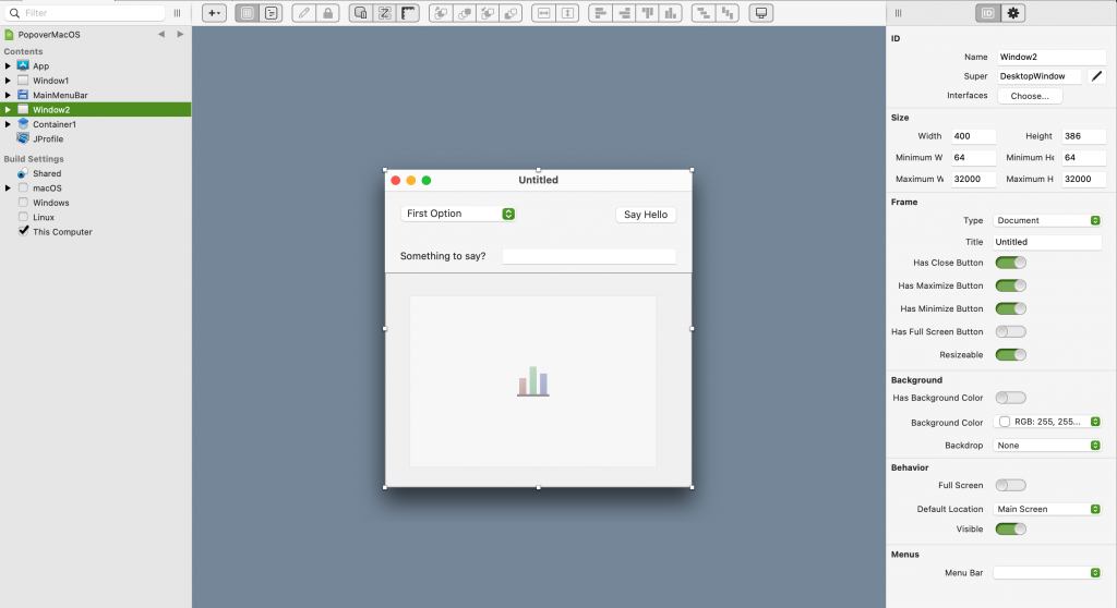
For example, here you can see that the content shown as a Popover in the previous screenshot is actually that of a Window (Window2) added to the project:

This introduces additional flexibility allowing your app’s logic to decide when to display a Window or Container instance as you have been doing until now, or display it as a Popover.
Showing a Popover
Displaying a Popover is very straightforward, whether it is created from a Container or a Window, the method is the same:
DesktopContainer.ShowPopover(parentControl As DesktopUIControl, facing As DesktopWindow.DisplaySides = DesktopWindow.DisplaySides.Bottom, detachable As Boolean = True)
The explanation of the expected parameters is as follows:
- ParentControl: The control that will act as the parent, or on which the Popover will be pointing to.
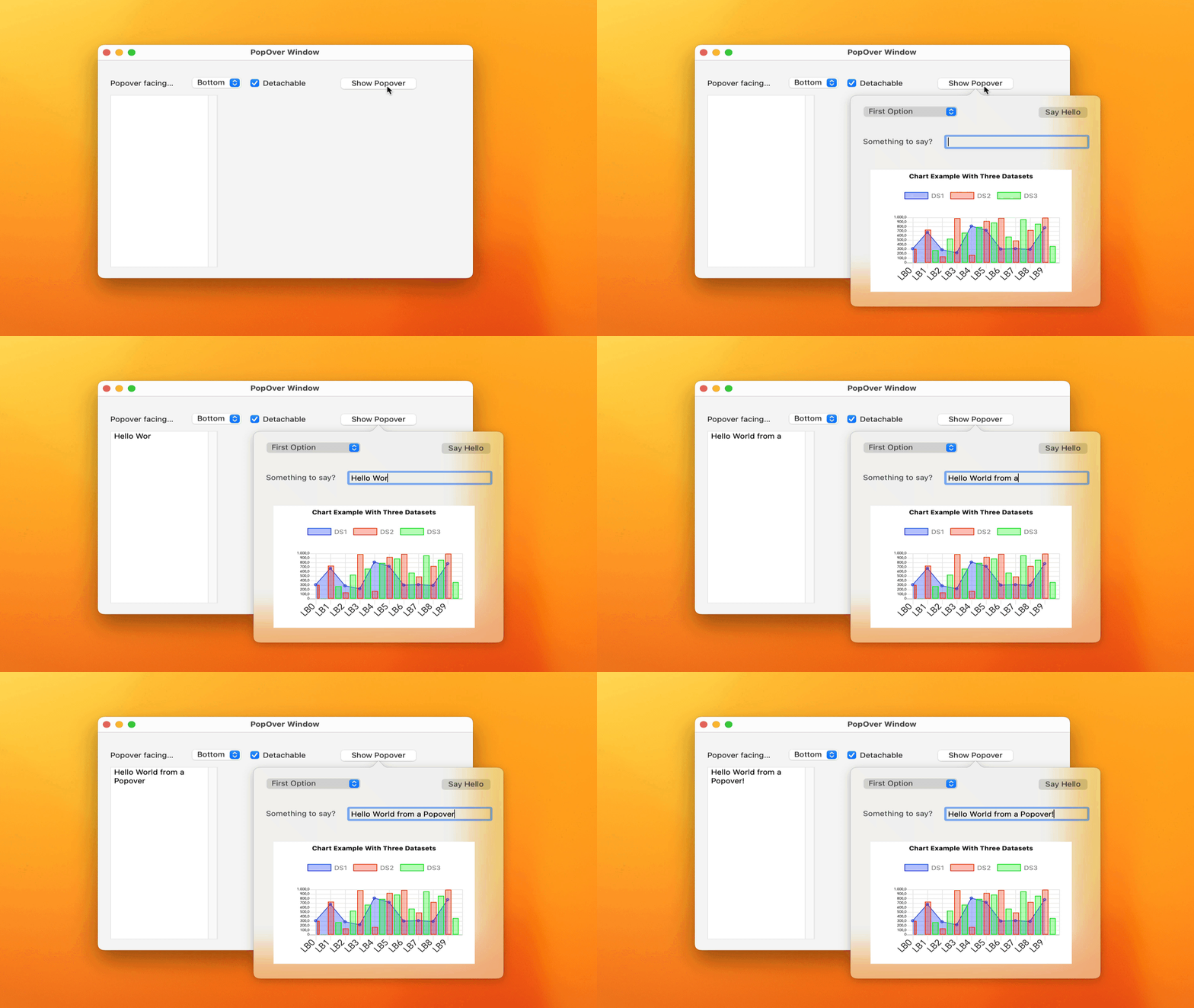
- Facing: The direction in which the Popover will point on the parent control; by default it will appear under the parent control, but you can use any of the values available in the DesktopWindow.DisplaySides enumerator (or the iOS equivalent).
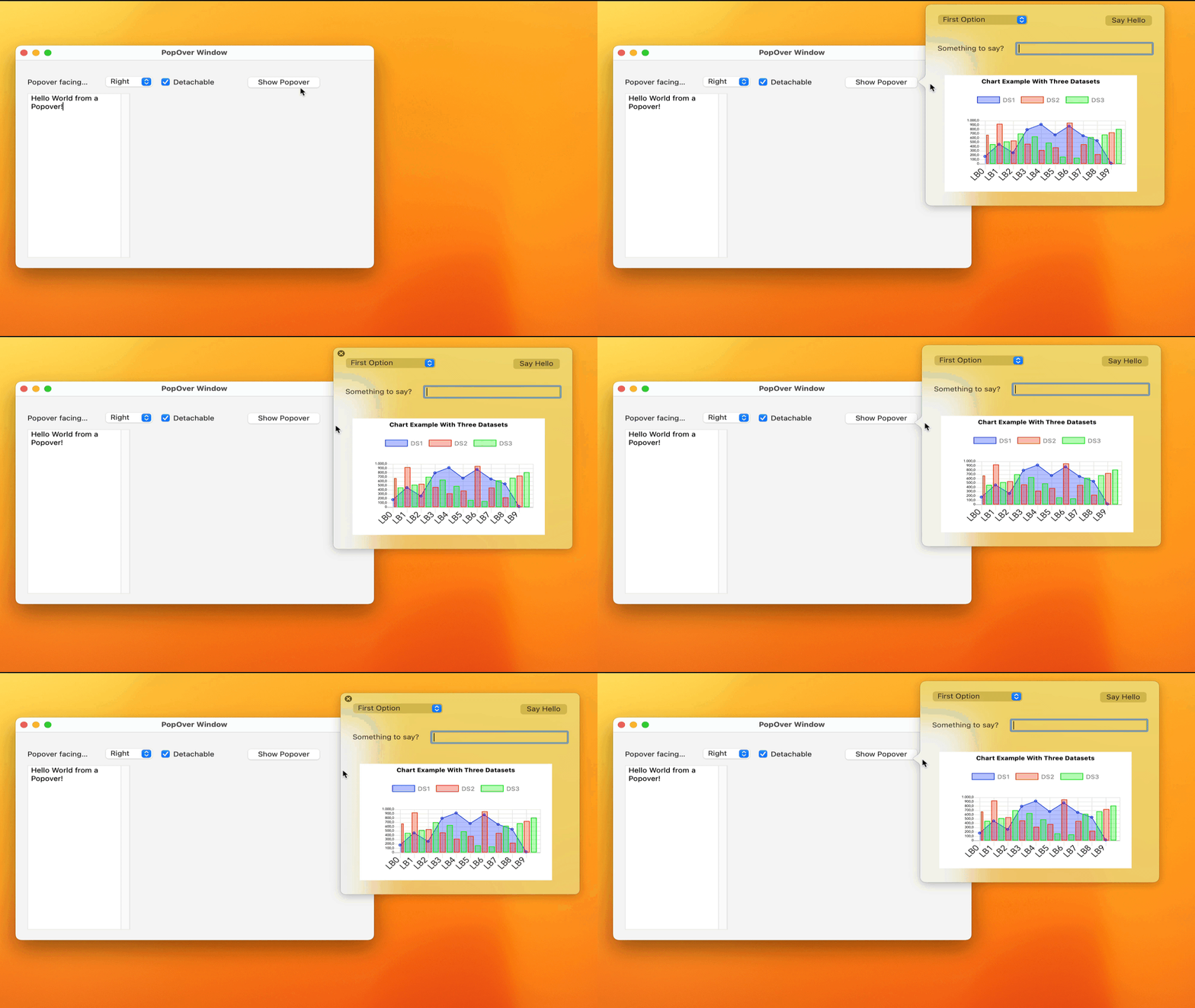
- Detachable: This value only applies to macOS Popovers, since said operating system has the ability for the user to “detach” the Popover from the parent control as long as this value is defined as True. To detach, drag the Popover with the mouse cursor.
Let’s say we have a window called Window2 and a button called MyButton. In the Pressed event of MyButton we can use the following lines of code to display Window2 as a Popover:
Var w As New Window2
w.ShowPopover(me)
And that’s all!

Platform Differences
In the previous section we already pointed out the first: macOS is the only operating system that acts on the value indicated in the Detachable parameter. But there are some other considerations to keep in mind so you don’t get caught off guard:
- Beyond the limits. Although in Windows and macOS Popovers can exceed the limits of the window on which the parent control is located, the position of the popover in Linux is restricted to the limits of the window that contains the parent control. This is the same for iOS and for Web pages.
- iPhone and iPad. When a Popover is displayed on an iPhone, it will look like a modal window; while if the same application is run on an iPad, the appearance will be the typical one expected from Popovers: the window pointing to the parent control in the indicated direction.
- On the Web. The contents of a Popover are those defined in a Container control, while on the rest of the platforms you can use both Container controls and Windows / Screens.
Why the Popover doesn’t “point” in the configured direction?
By default it will try to do so according to the value that has been set in the “facing” parameter, but if it does not find enough space on the margins of the screen, then it will be displayed on the next side of the parent control in which there is available space for display the Popover in its full width and height; This is true on macOS, Linux, Web and iOS.
Can I reuse a Popover?
No, You can not. Whether you use a Container control or a window as the source of the UI design to be displayed by the Popover, do not lose sight of the fact that the Popover is just another type of window; and therefore behaves as such. That is, once it is closed either because it has lost focus or because you have closed it explicitly through code invoking the Close method, all the displayed controls and the rest of the internal structures will be closed / invalidated, so that although the instance If a Popover is not Nil (because, for example, you keep a reference to the window or container instance used as the UI source), you will not be able to invoke the ShowPopover method again on said instance but you will have to create a new instance of the Container/ Window used as the source of the UI to be displayed by the Popover.
How can I communicate with the UI elements contained in the Popover?
You would do so just as you would do with any other type of window that you have been using so far in your Xojo projects.

Conclusion
Without a doubt, Popovers are a new way to improve the design of your apps’ user interfaces, providing a more direct relationship between the user interface elements displayed in the Popover and the “parent” control in charge of displaying it. Furthermore, since you can use any window or container you want as the source of the UI to be displayed by the Popover, you will have greater flexibility about when you want to display them in a Popover or display them using any other of the available window types or, in the case of Containers, embedding them as part of other UI elements at runtime.
Javier Menendez is an engineer at Xojo and has been using Xojo since 1998. He lives in Castellón, Spain and hosts regular Xojo hangouts en español. Ask Javier questions on Twitter at @XojoES or on the Xojo Forum.
