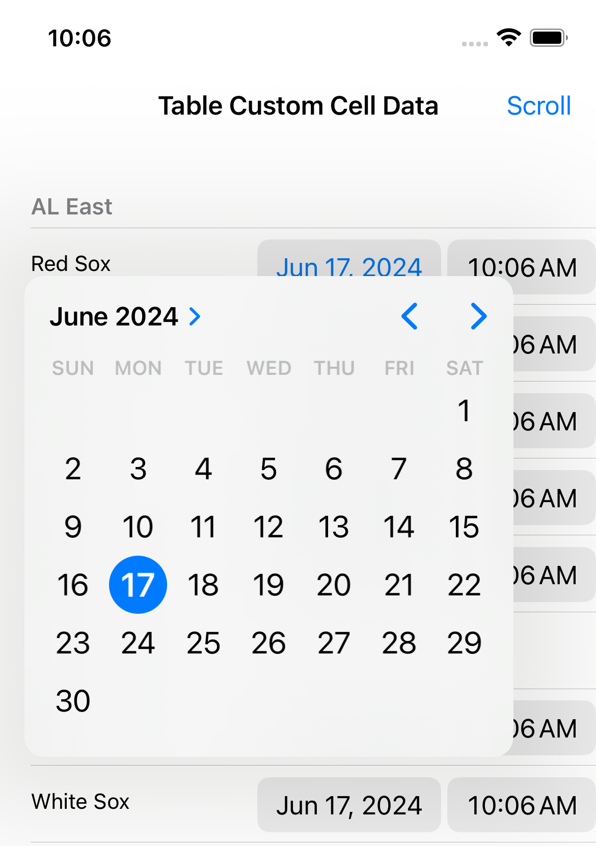
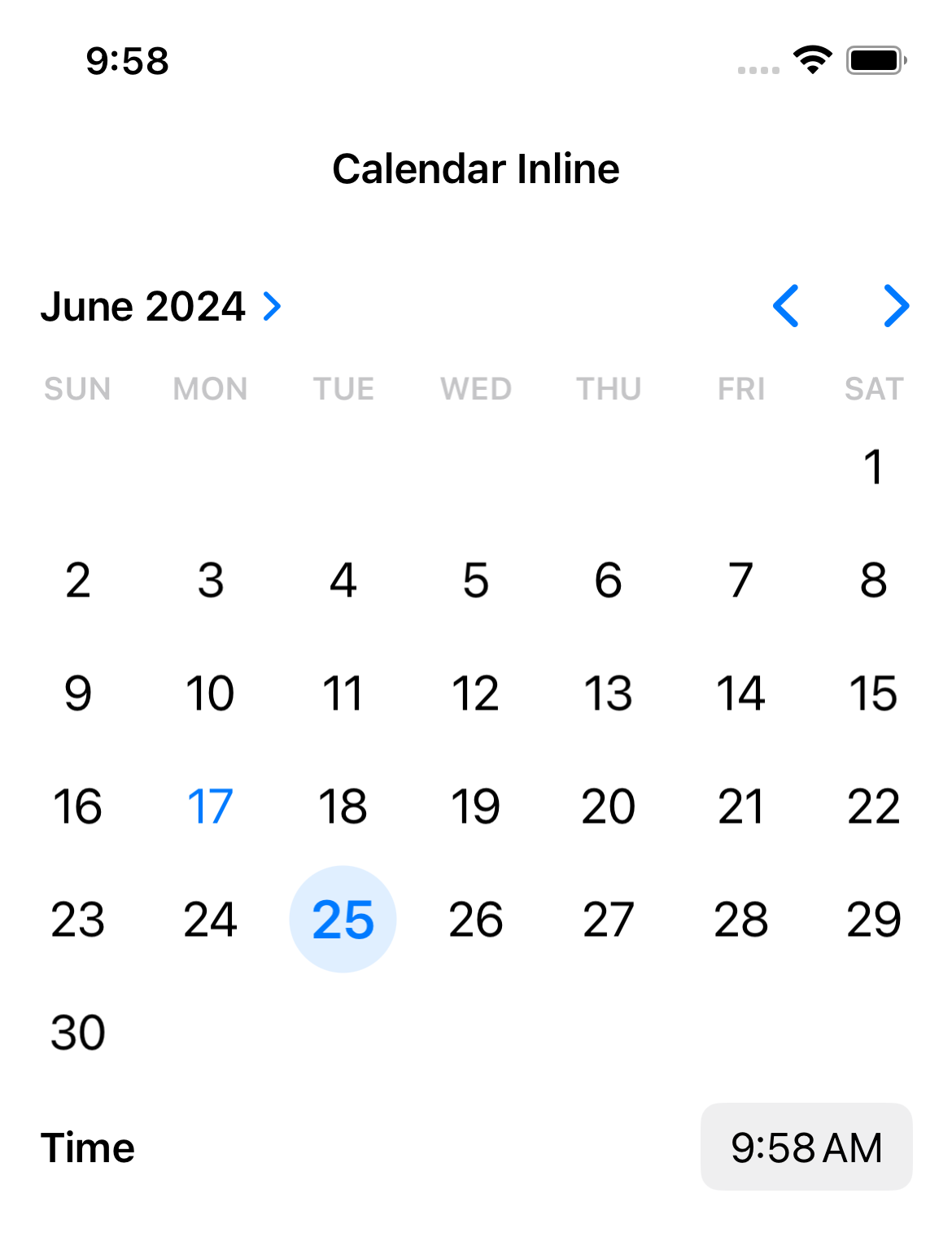
Xojo 2024r2 introduces two new styles for the iOS DateTimePicker control. In previous releases, the DateTimePicker control offered only the Wheels Display Style. This release adds two more options: Compact and Inline. The Compact and the Inline Display Styles will allow you to create cleaner and more flexible user interfaces in your iOS apps.
Compact Display Style
When using the Compact Display Style, the control adjusts itself to offer two fields for Date and Time selection or just one field in those cases when the Display Mode is set to Date or Time. In any case, this Display Style consumes less real screen space in the UI, making it ideal for more compact interface designs.
For example, use it when designing custom cells for a MobileTable DataSource:

Inline Display Style
On the other hand, the Inline Display Style is ideal for date selection because it renders a calendar in the view that speeds up the date selection by the user. It includes options for rapidly moving among the month or the year to be displayed. This is much faster compared with spinning the wheel for a date in the Wheels Display Style:

Conclusion
We are sure that the new Inline and Compact Display Styles will help polish your UIs and we look forward to seeing how you use them in your iOS apps. Thank you to everyone who filed cases and offered feedback for this release.
Happy coding!
Javier Menendez is an engineer at Xojo and has been using Xojo since 1998. He lives in Castellón, Spain and hosts regular Xojo hangouts en español. Ask Javier questions on Twitter at @XojoES or on the Xojo Forum.
