Starting with iOS 9, some iPads now support app multitasking which allows you to use more than one app at a time on the device. These apps can be displayed side-by-side or with an overlay. Your Xojo iOS apps support this feature automatically when all the Supported Orientations for the iPadScreen are turned on for your app.
Comments closedTag: Apple
Xojo is a great way to start making iOS apps. Whether you an app developer or you are just learning and want to make your own iOS apps, here are some reasons why you ought to look at Xojo.
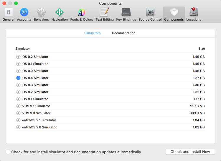
Comments closedWhen you run your iOS projects from Xojo, they launch in the iOS Simulator. You can change which simulator starts by going to the Shared…
Comments closedLast year with iOS 9, Apple announced a new security requirement for your iOS and OS X apps: App Transport Security. From Apple’s docs: Starting in…
1 CommentXojo is a popular way to create cross-platform apps for Windows, OS X, Linux, Raspberry Pi, web and iOS. I’m not surprised because Xojo makes creating software fast and fun! Xojo really is the best way to create cross-platform software.
Comments closedAnyone who has built an app in Xojo has used the Listbox method AddRow to create new rows. The iOSTable control in Xojo also has an AddRow method. However, unlike building a desktop app, AddRow is not always appropriate for iOS apps.
Comments closedIn the blog post Smartphone Encryption is a Red Herring, I pointed out the folly of requiring an encryption back door for the Good Guys to use. So the question arises- “What can be done? If we don’t want a global encryption back door that can be used by anyone, can we still track the Bad Guys?”
The answer is yes. There are plenty of options that don’t require a global back door. I’m not passing judgment on whether these are inherently good or bad options, just that they are available when there is a reason to track a Bad Guy.
Comments closedWhen doing a lot of manipulation to a TextArea’s contents under Cocoa, performance can suffer due to the underlying NSTextView doing work on layout and glyph selection. This can be sped up by telling the text view that you’re going to begin editing. You can do this by using a few Cocoa Declares.
Comments closedIt’s time again for Hour of Code! The Hour of Code is a global movement reaching tens of millions of students in 180+ countries. Anyone, anywhere can participate in Hour of Code, from ages 4 to 104. At Xojo, we are again participating in this wonderful way to help people learn to program.
Comments closedWith the release of Xcode 7, Apple combined the iOS and Mac Developer programs into a single Developer Program. Previously these programs were $99/year for each and now they are $99/year for the combined Apple Developer Program which lets you create and deploy apps for iOS and OS X.
Comments closed

