
Graphic chart support is new in Xojo Desktop and Xojo Mobile (iOS) in Xojo 2023r1. The new DesktopChart and MobileChart offer a similar look and behavior to what you find when using Xojo’s WebChart. Let’s review all the things you can do with the new DesktopChart and MobileChart in your Xojo projects.
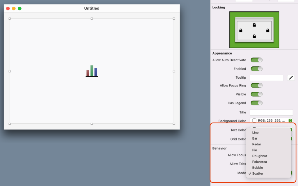
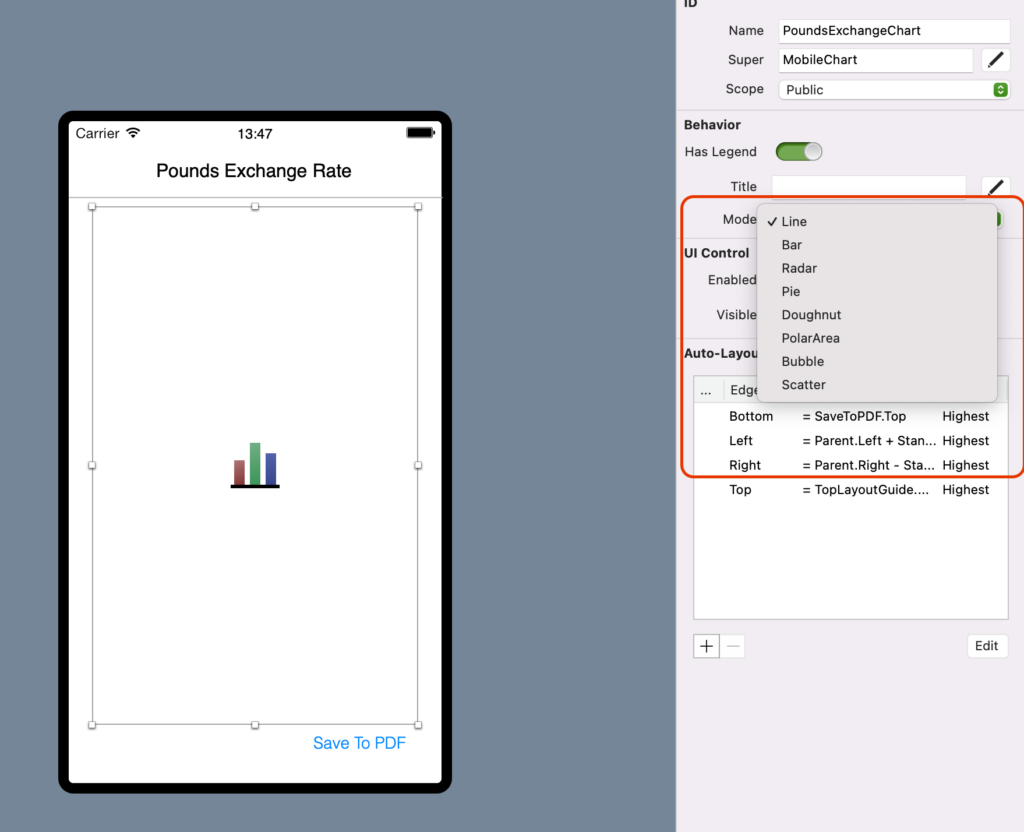
Just as with Xojo’s WebChart, DesktopChart and MobileChart offer the following chart types: Line, Bar, Pie, Doughnut, PolarArea, Scatter, Bubble and Radar. You can access these charts using the Inspector Panel or via code through the Mode property. You can even change the Mode (or chart type) at runtime on Desktop and Mobile.
Line and Bar types are similar; both display sets of data that have been set to Line or Bar Modes. Display as many data sets as you need in your DesktopChart or MobileChart by setting the Mode to Line or Bar. The only difference is how these will be displayed along the x axis.
To better understand, let’s write some code in the Opening Event Handler of a DesktopChart control added to a Desktop project:
Var labels() As String
Var firstSetOfData() As Double
Var secondSetOfData() As Double
Var thirdSetOfData() As Double
For n As Integer = 0 To 9
labels.add "LB"+n.ToString
firstSetOfData.add System.Random.InRange(0,1000)
secondSetOfData.add System.Random.InRange(0,1000)
thirdSetOfData.add System.Random.InRange(0,1000)
Next
Me.mode = DesktopChart.Modes.Line
Me.Title = "Chart Example With Two Datasets"
Me.AddLabels labels
Var DS1 As New ChartLinearDataset("DS1", Color.Blue, True, firstSetOfData)
DS1.ChartType = ChartLinearDataset.ChartTypes.Line
Var DS2 As New ChartLinearDataset("DS2", Color.Red, True, secondSetOfData)
DS2.ChartType = ChartLinearDataset.ChartTypes.Bar
Var DS3 As New ChartLinearDataset("DS2", Color.Green, True, thirdSetOfData)
DS3.ChartType = ChartLinearDataset.ChartTypes.Bar
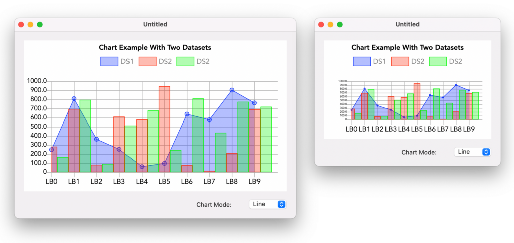
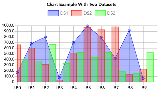
Me.AddDatasets DS1, DS2, DS3This is how it will look when the Chart has been set to Line, displaying three data sets: one of which has been set to Line and the other two to Bar:
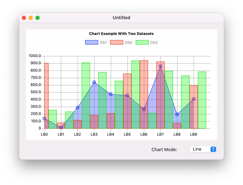
As you can see, when the ChartType is Line, the data sets that are set to Line start drawing at the origin of the X axis, where the labels are also drawn for each column of data. This also happens when drawing data sets whose ChartType is set to Bar; thus, the first bar on the first column has half the width.
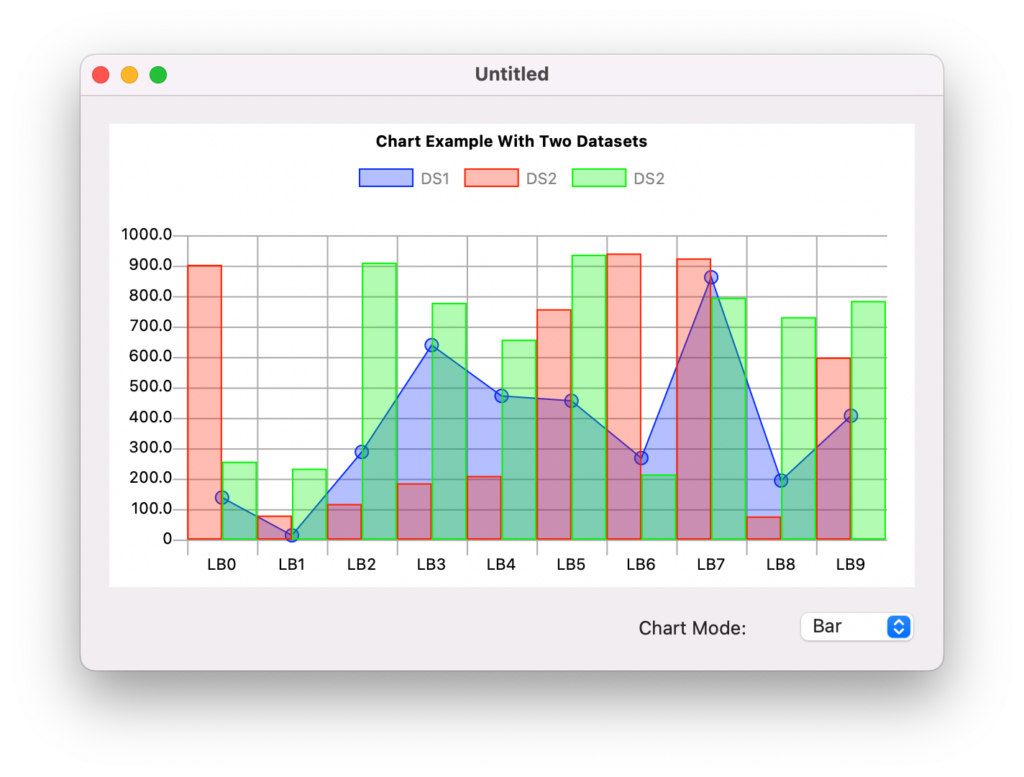
Below shows the same data sets but the ChartType is Bar. Now the Bar data sets overlay the position for the labels drawn along the X axis (they are centered on each column), and also have full the width. However, because of that, the data set whose ChartType is set to Line starts drawing at half the width of the column.
You can add as many new data sets as you want, remove them, update their values, color, etc. The chart will update to reflect the changes, including the minimum and maximum values displayed in the Y axis. Keep in mind, if a chart’s Mode has been set to Line or Bar it will only display data sets created as ChartLinearDataset (by default they are set to the Line ChartType). WebChart will behave the same, starting with Xojo 2023r1.
One difference to note when using ChartLinearDataset is that you can set the Transparency property ranging from 0 (fully opaque) to 100 (fully transparent), as well as the CornerSize when the ChartLinearDataset ChartType is set to Bar.
ChartDataset and Chart Modes
I already showed you that a chart set to Line or Bar only displays data sets created from the ChartLinearDataset class. A similar rule applies when the chart is set to other Modes. For example, Pie, Doughnut, PolarArea or Radar charts only display data sets created from the ChartCircularDataset class.
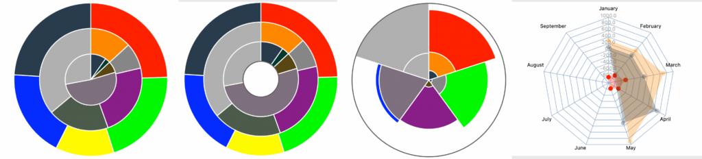
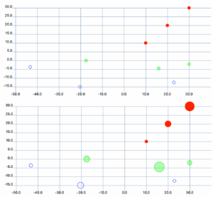
- In the same vein, Scatter and Bubble charts only display data sets created from the ChartScatteredDataset class.
DesktopChart and MobileChart, additional Properties
DesktopChart and MobileChart offer additional customisation properties. For example, you can set the font, font size and font color for the title, legend, labels and values on the Y axis.
When setting the maximum font size used for the drawing of the Y axis values based on the chart control instance size (height), if the height of the control is not enough to display the values at the specified font size, it automatically adjusts.
Other properties to further customize the look of the chart include BackgroundColor and GridColor.
Tip: You may want to set the color to Color.Clear if you want your charts to be drawn or “visible”, like if you plan to layout the chart control on top of other UI controls.
In addition, you can control whether or not to display that popup that shows the underlying value as the user moves the cursor (or while dragging their finger, on iOS). This is done through the AllowPopover property (True, by default).
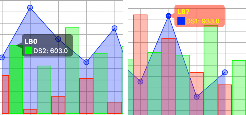
Set the background and text color in the Popover using the PopoverBackgroundColor and PopoverTextColor properties. These expect a ColorGroup instance, so they can adjust when the control is in Light or Dark Mode.
Getting informed
As you may expect from their WebChart counterpart, DesktopChart and MobileChart offer a Pressed event handler to receive the index and dataset instance over which the user clicked/tapped.
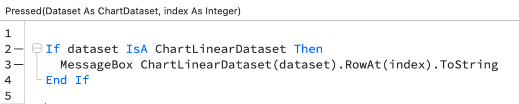
Because the chart control can handle different ChartDatasets you’ll probably want to cast the received ChartDataset instance received in the Pressed handler to the right one before proceeding with any actions that are not common to all kind of ChartDatasets.
Draw it!
You can call the DrawInto method on a chart, provide the expected graphic context and also the left and top values to proceed with the drawing. For example, this is what a DesktopChart looks like when drawn on a Picture of the same size:
It is also possible to render the chart to PDF in a vectorial way using the AddChart method on a PDFDocument instance. The parameters this method expects are the chart instance itself, the X and Y values (where it will be placed in the current PDF page), and the width and height values for the rendering.
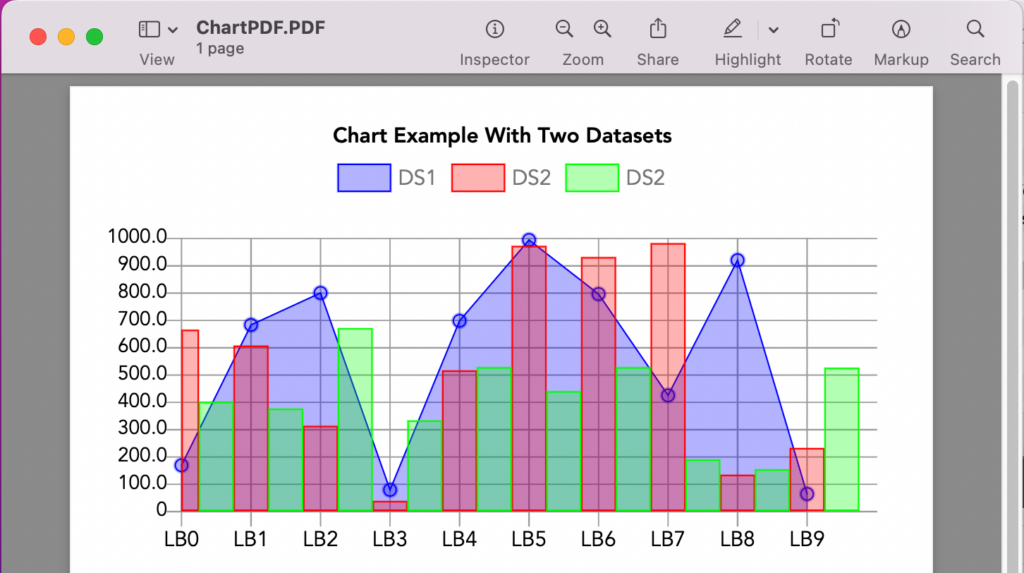
For example, this code will create a PDF file in the Desktop with the same height value of the chart instance, with the width set to the width of the page, minus the margins:
Var d As New PDFDocument
Var g As Graphics = d.Graphics
d.AddChart(chart1, 20, 20, g.Width-40, chart1.Height )
d.Save(SpecialFolder.Desktop.Child("ChartPDF.PDF"))
In summary
As you can see, now it is possible to add Graphical Charts to your Desktop and iOS projects with the same ease and in the same way it is already possible on web projects, plus some more customization options. Watch a quick video on this topic. No license is required to learn, develop and test your projects in the latest Xojo release! Download Xojo 2023r1 today!
Javier Menendez is an engineer at Xojo and has been using Xojo since 1998. He lives in Castellón, Spain and hosts regular Xojo hangouts en español. Ask Javier questions on Twitter at @XojoES or on the Xojo Forum.